Website Positioning & Concept
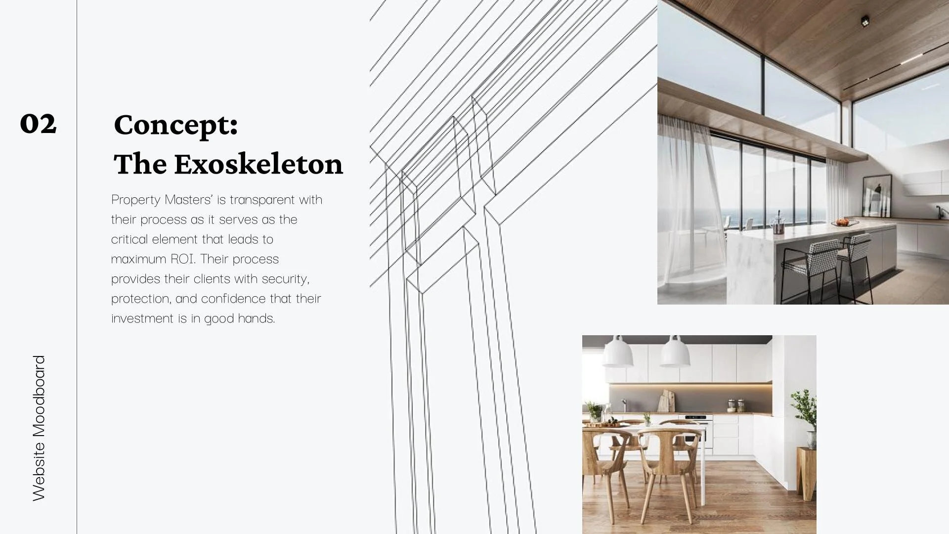
The goal for the new website was to reposition Property Masters as a premier/concierge service experience. To meet these requirements, I came up with a concept called "The Exoskeleton", and it centered on Property Masters' transparent and seamless process (which serves as the critical element that leads to gaining client's maximum ROI). Their process provides their clients with security, protection, and confidence that their investment is in good hands.
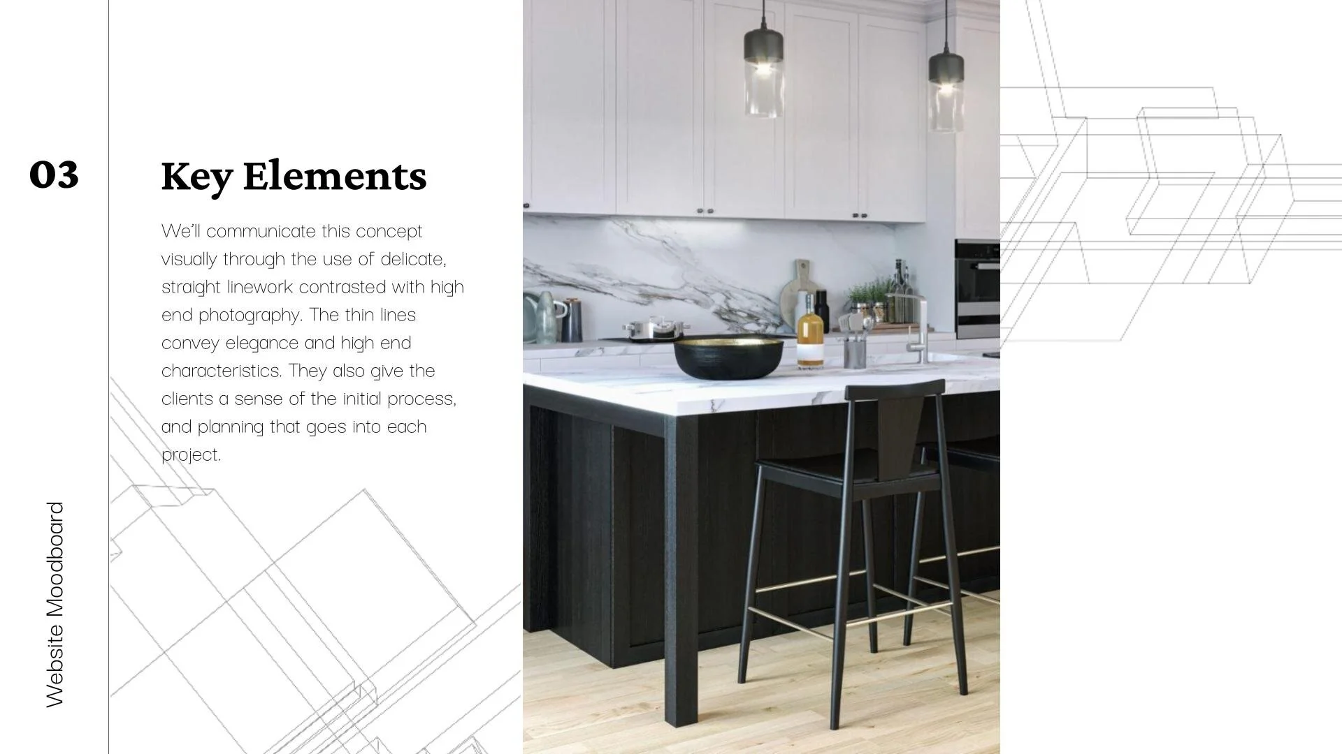
Key Visual Elements
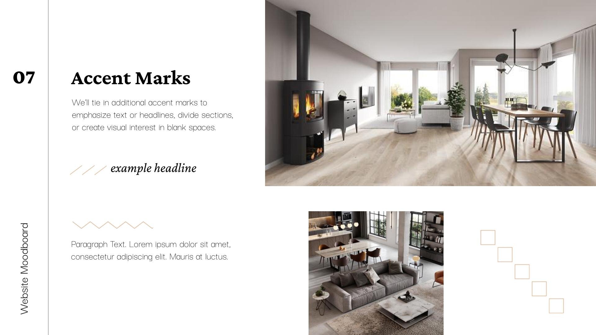
My visual design strategy incorporated delicate line work, white space, and an updated color palette.
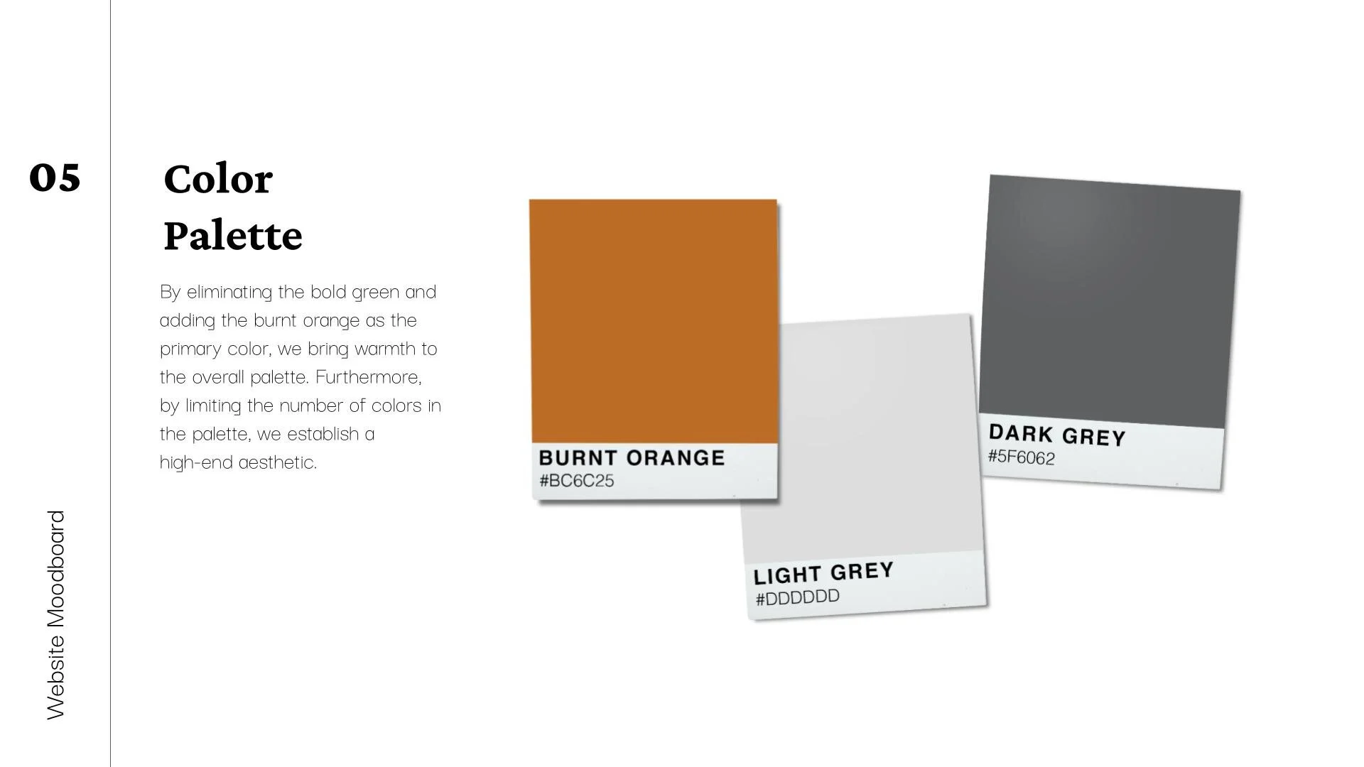
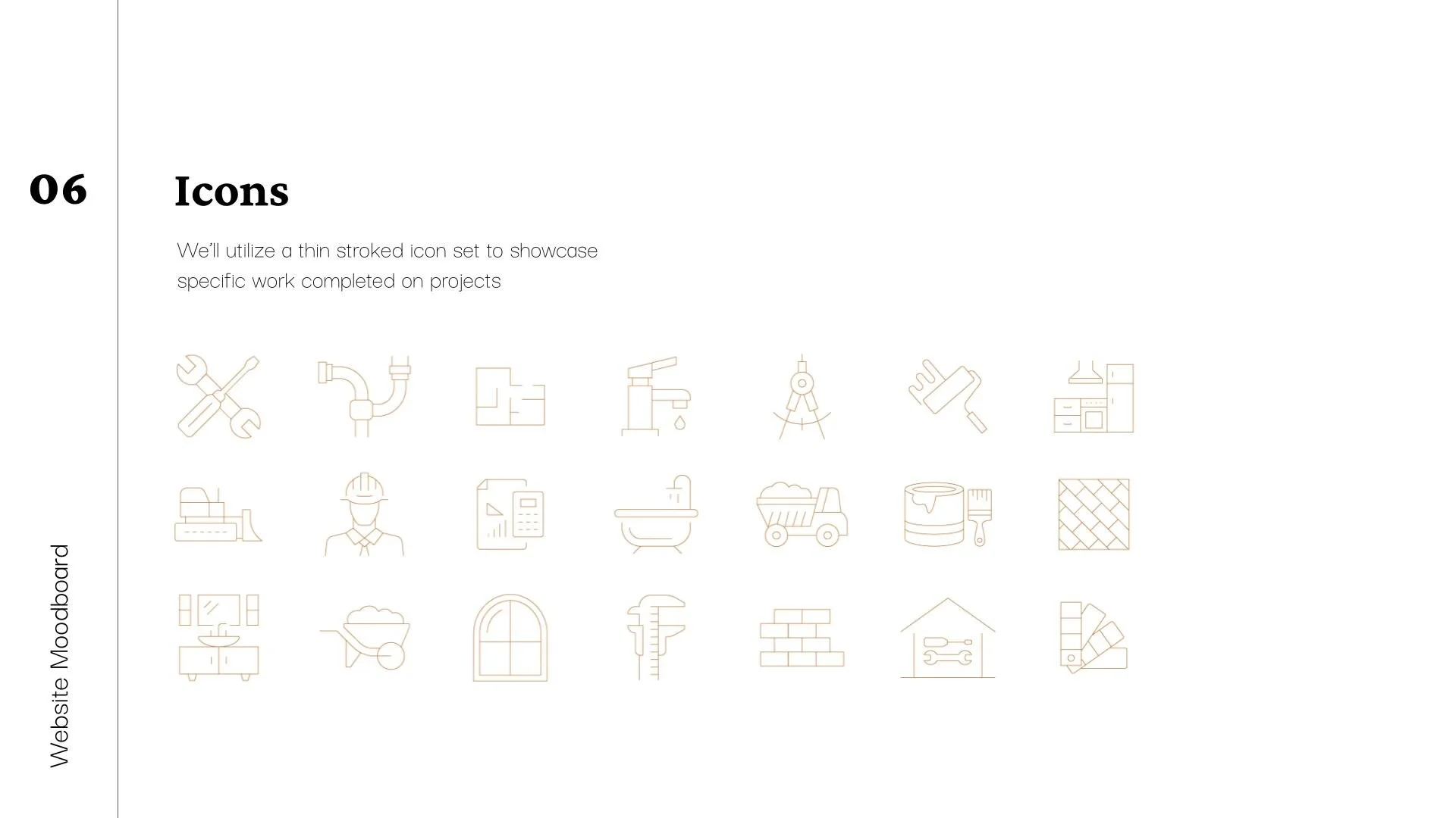
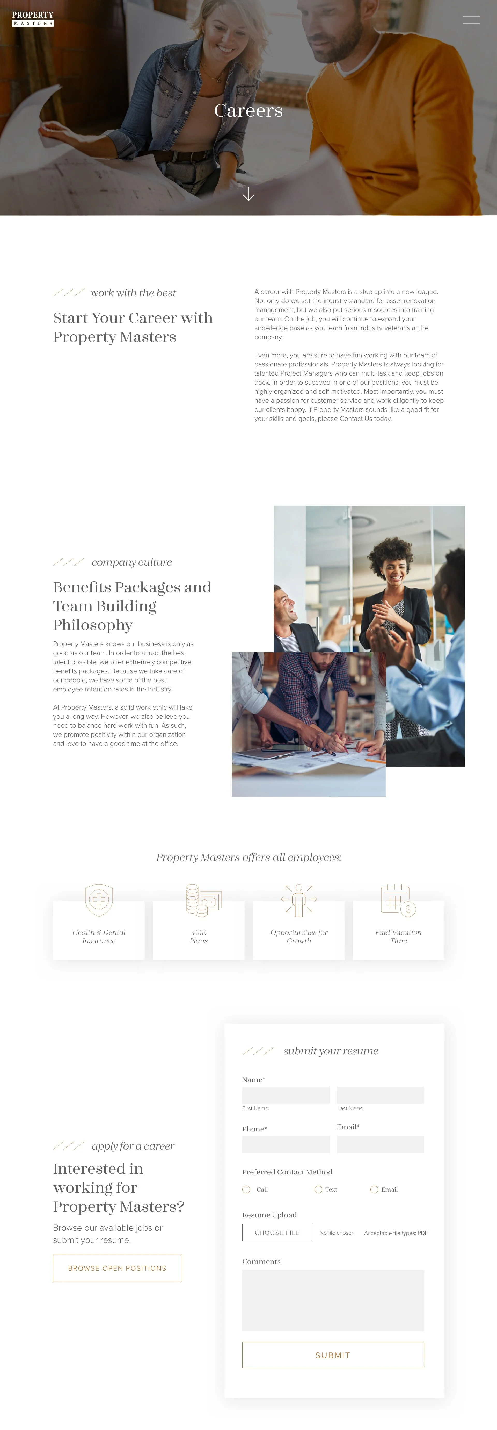
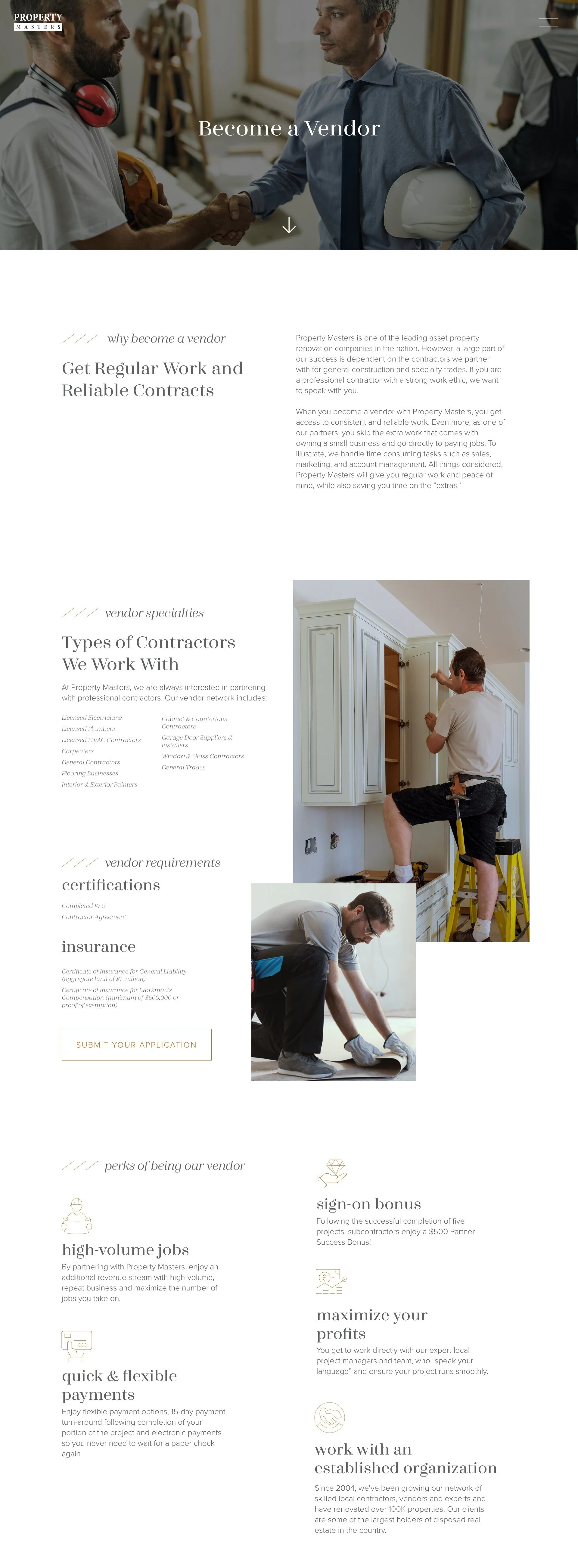
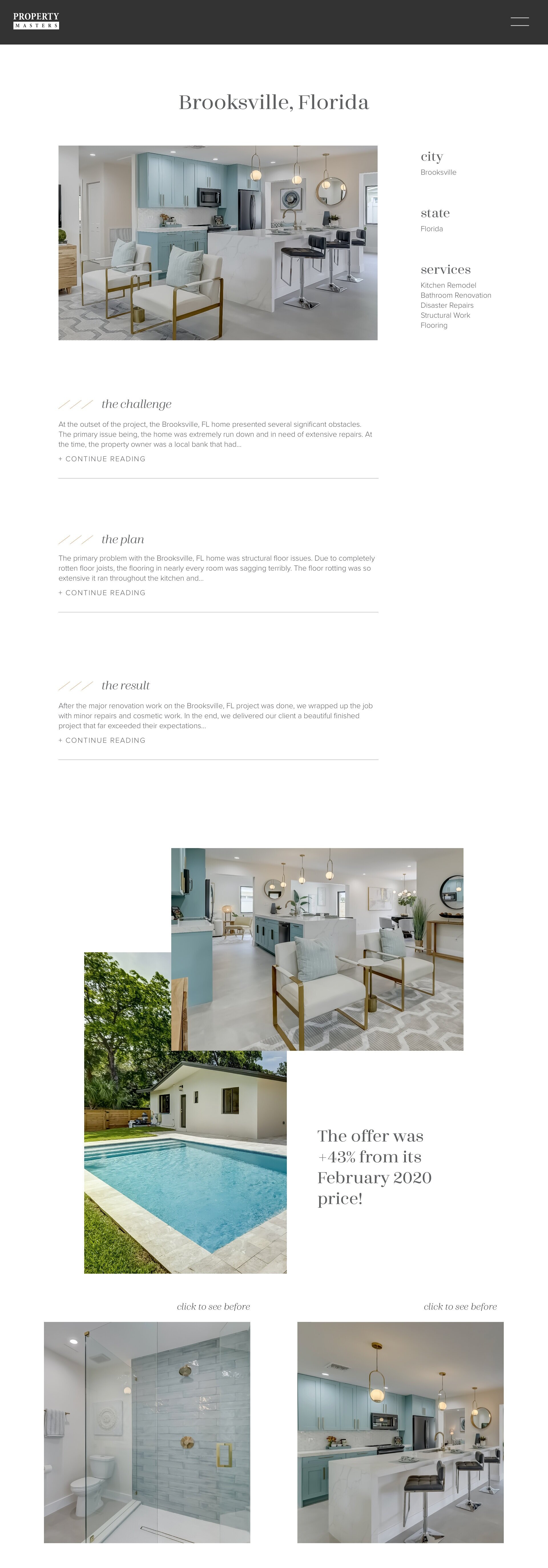
The thin lines utilized throughout the site (used in accent marks, backgrounds, and icons) convey elegance and high-end characteristic, while also unifying the website design across pages in a visually arresting way. The lines also hint to their initial process, and planning that goes into each project - with blueprints, layouts, architectural plans, etc. I eliminated the bold green from their color palette and incorporated a burnt orange. This brought more warmth to the overall palette. Furthermore, by limiting the number of colors in the palette, I established a more high-end aesthetic.
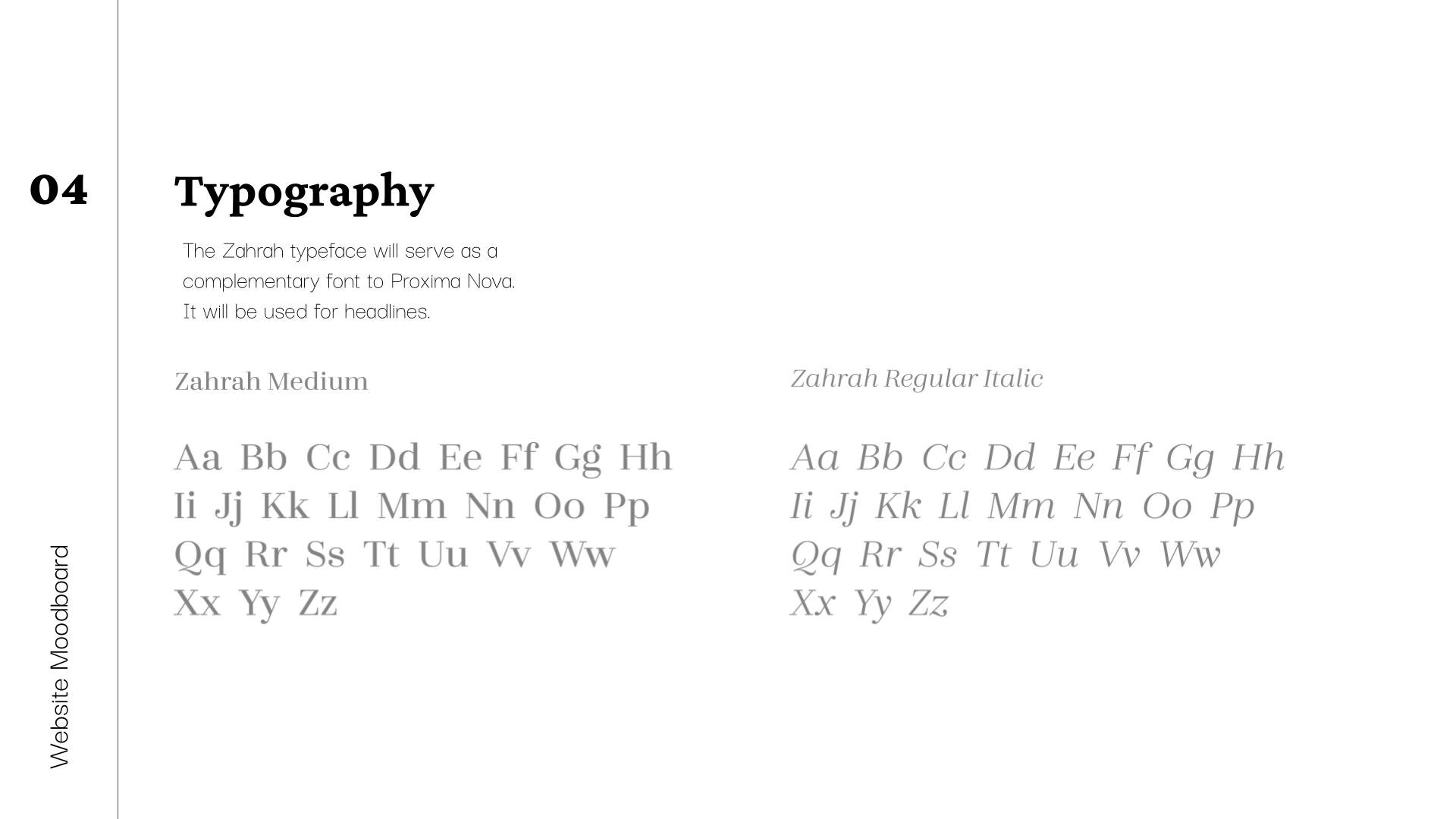
Typography
Zahrah was the perfect complement to their existing font Proxima Nova, used for paragraph text. Zahrah was a modern, serif, that was clean, refined and trendy - everything they wanted to be as a brand. Furthermore, this typeface was versatile, and beautiful in different weights and sizes.
Each headline font within the Zahrah typeface was carefully and meaningfully selected. For example, the H2's were an italic, light weight, to bring emphasis to that text, without being overbearing. The slanted line accents to the left of the H2s brought further emphasis to this text while tying in the delicate linework seen throughout the site. The H3s were a bold, larger size pt, to draw the visitor's eye, first, to this "catchier" copy.

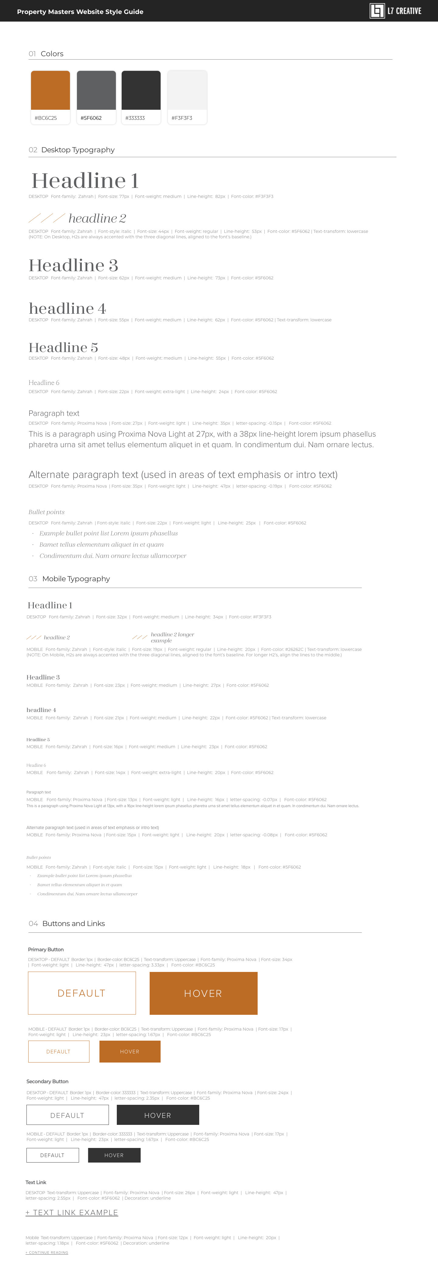
Wireframes, Design, & Style Guide
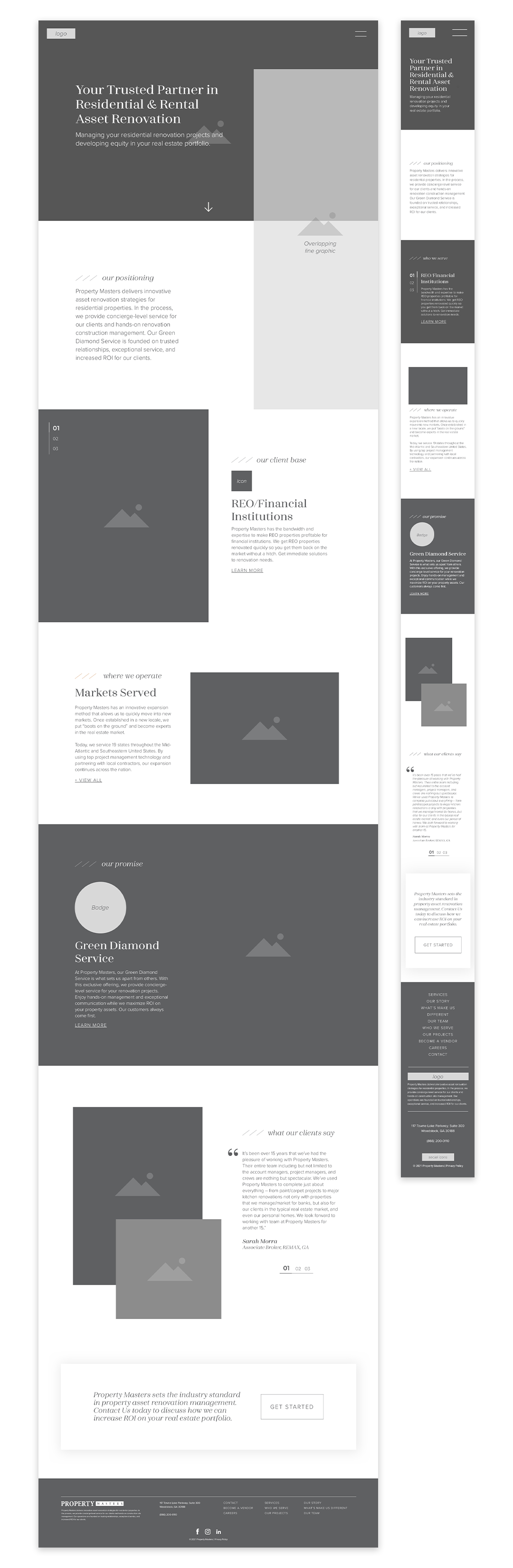
Using Sketch, I started by creating a full set of wireframes to give our a client a sense of layout and flow. Following approval of those, I followed up with a full set of design comps - complete with colors and images. The style guide was given to our developer to give them a clear guideline for typography, color, and button applications.
Wireframe
Design
Style Guide
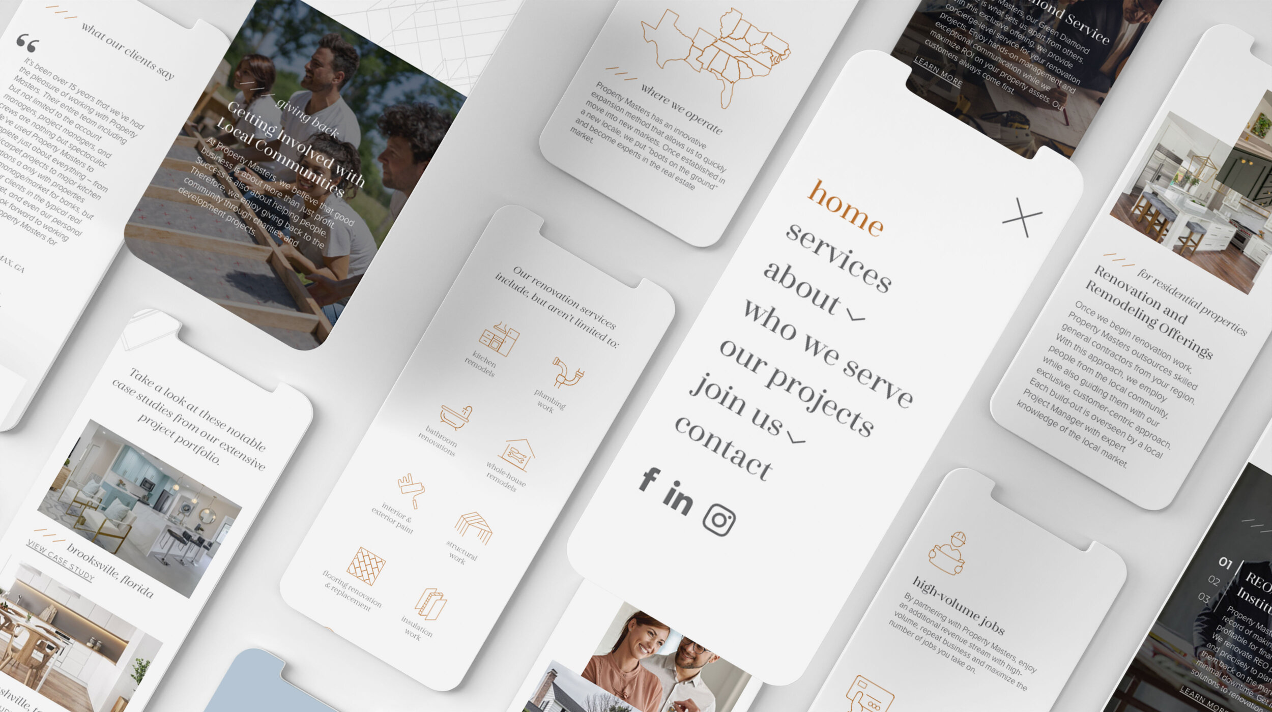
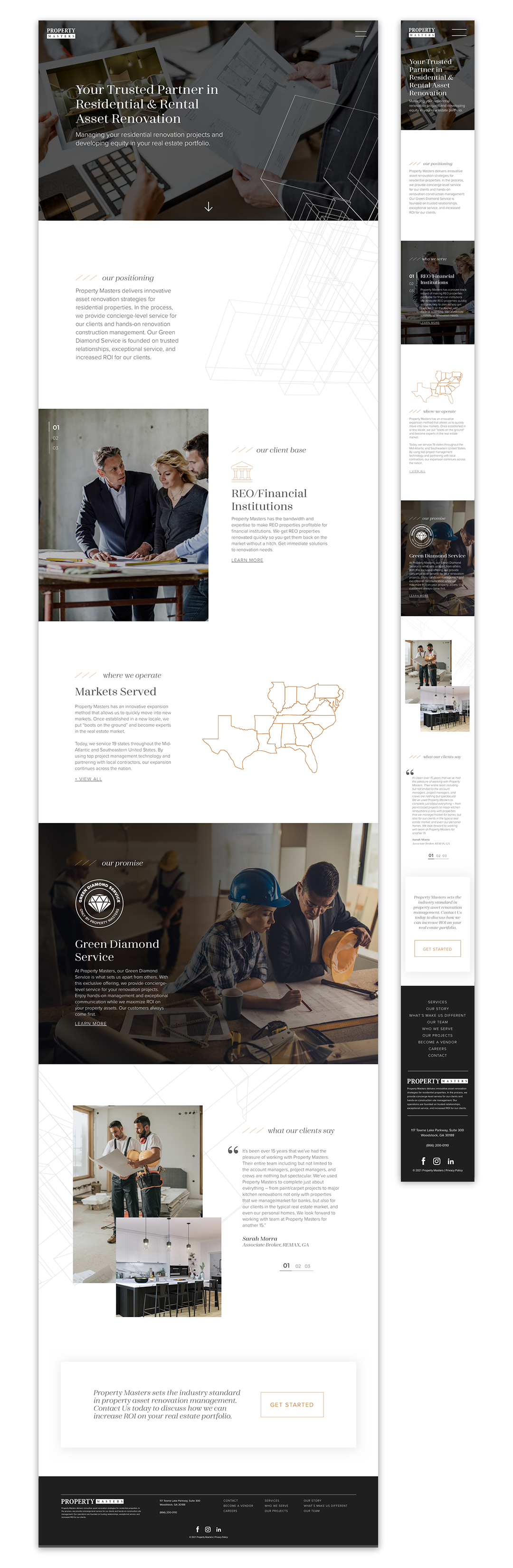
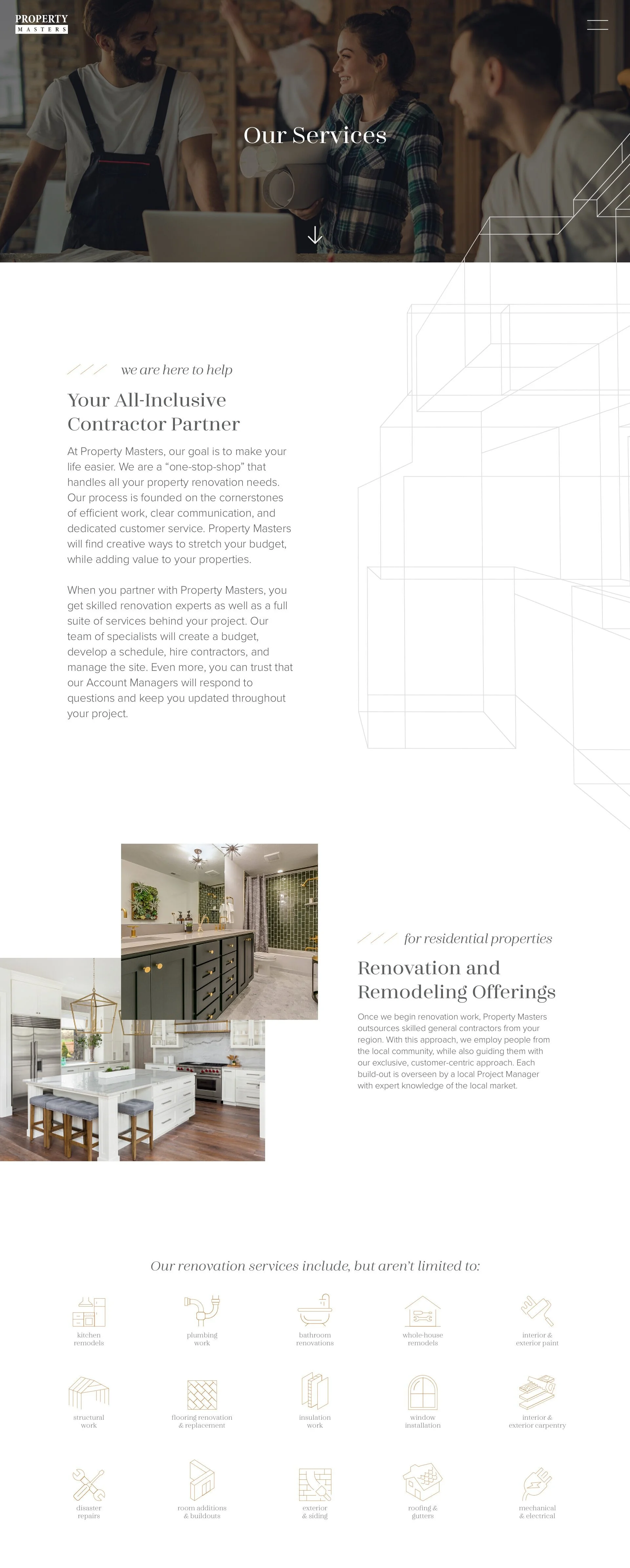
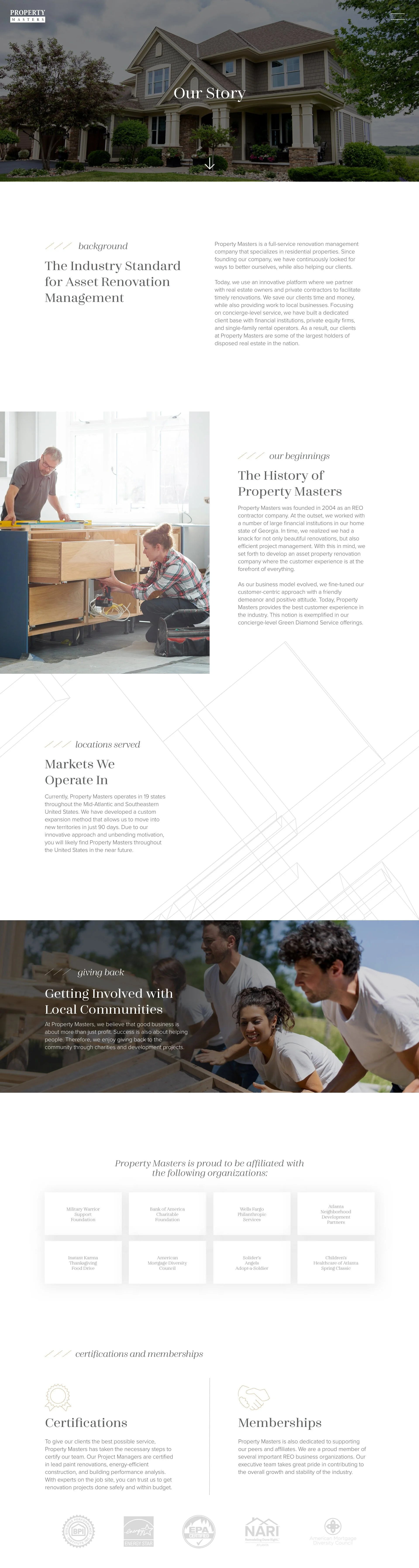
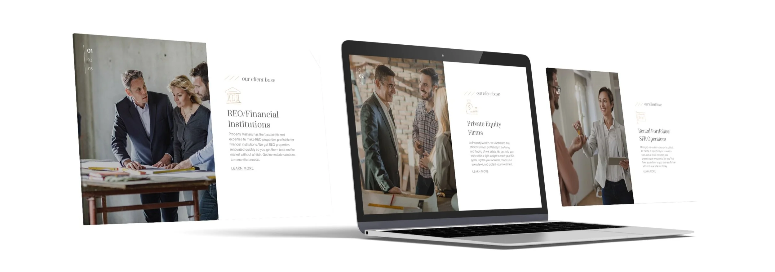
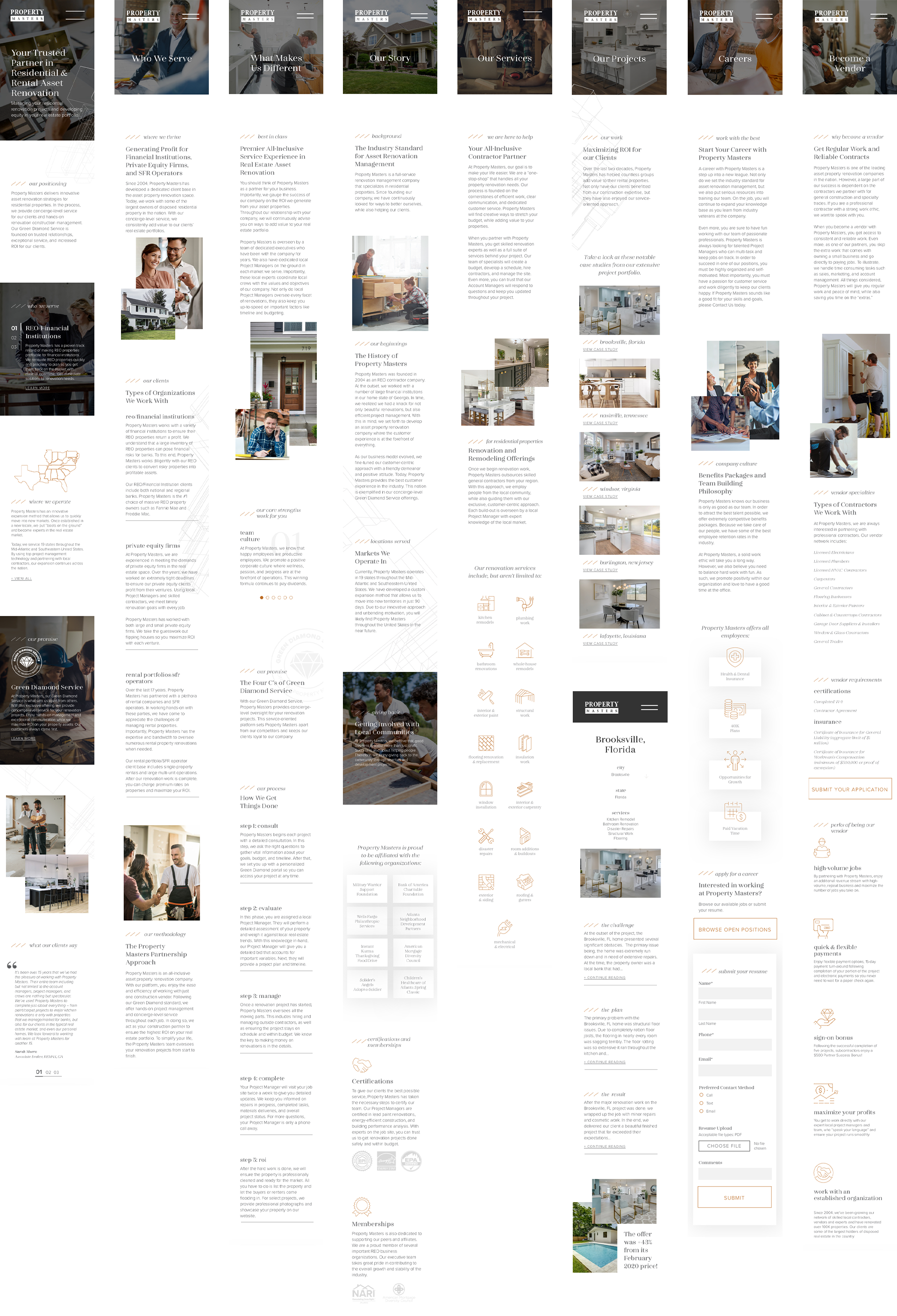
Desktop Designs
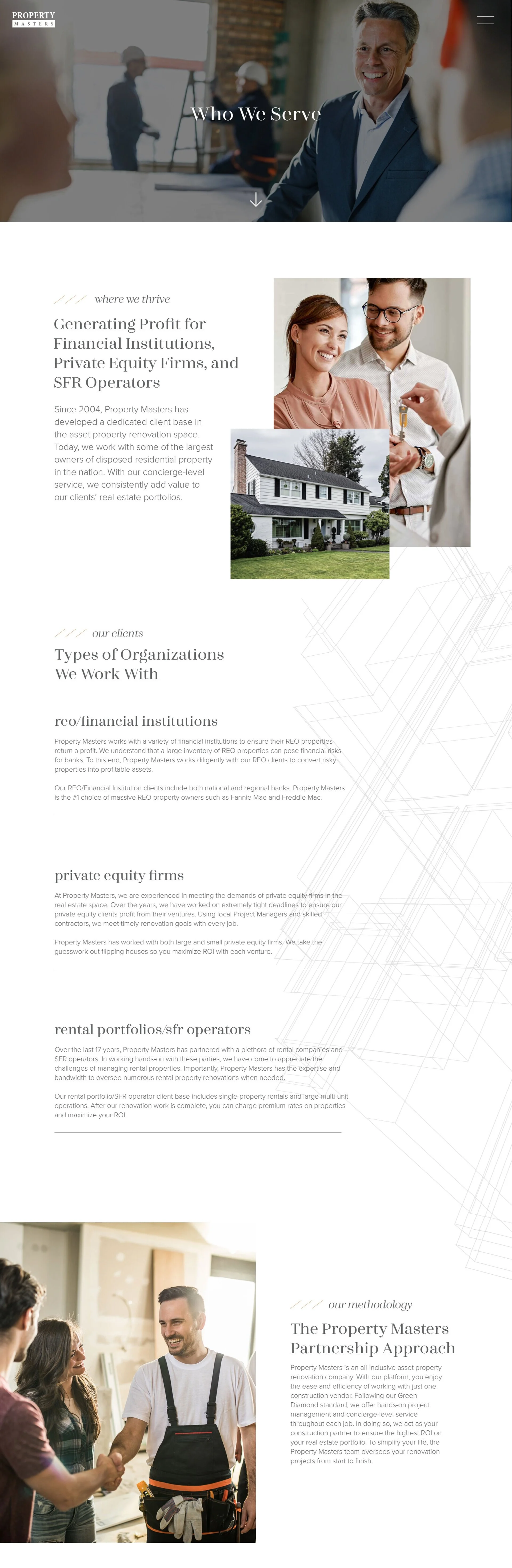
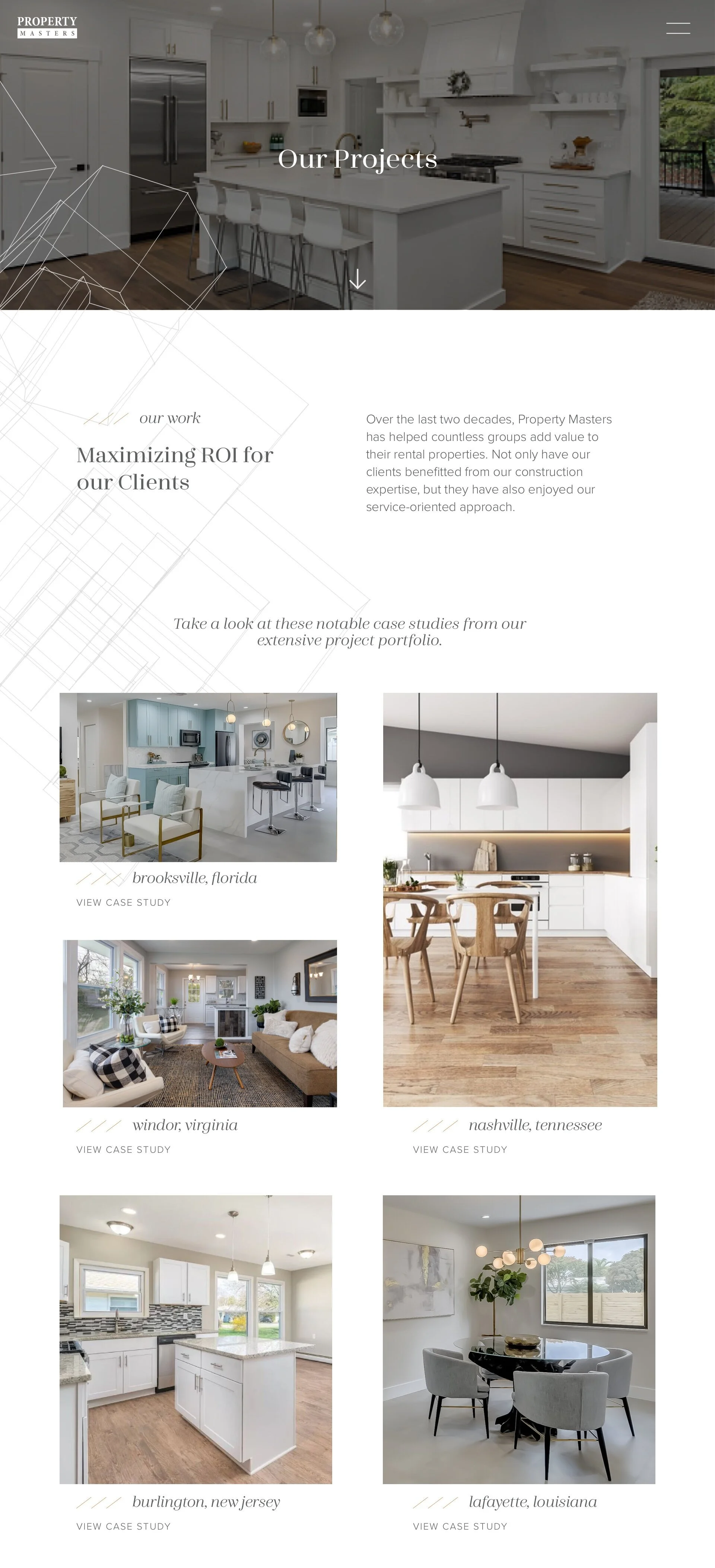
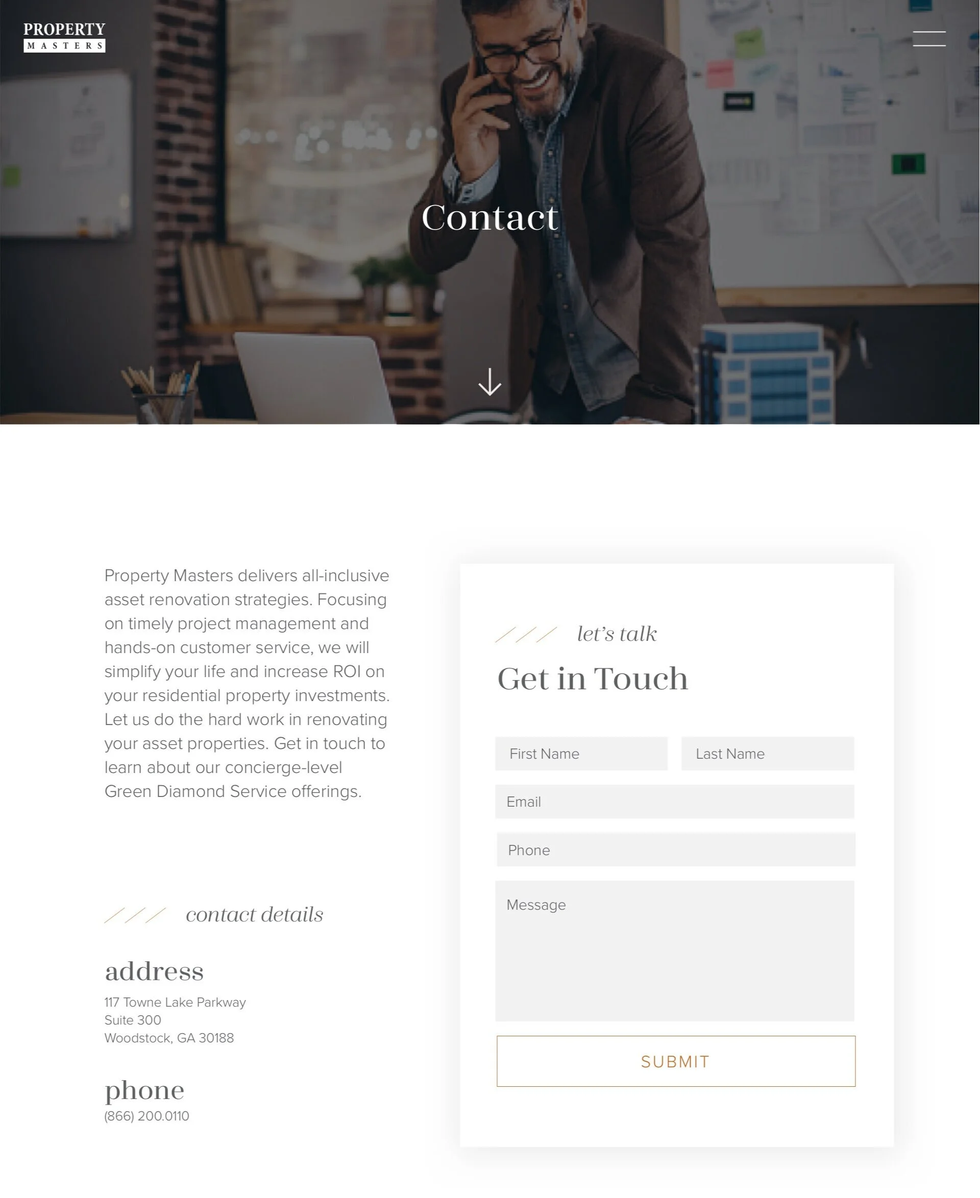
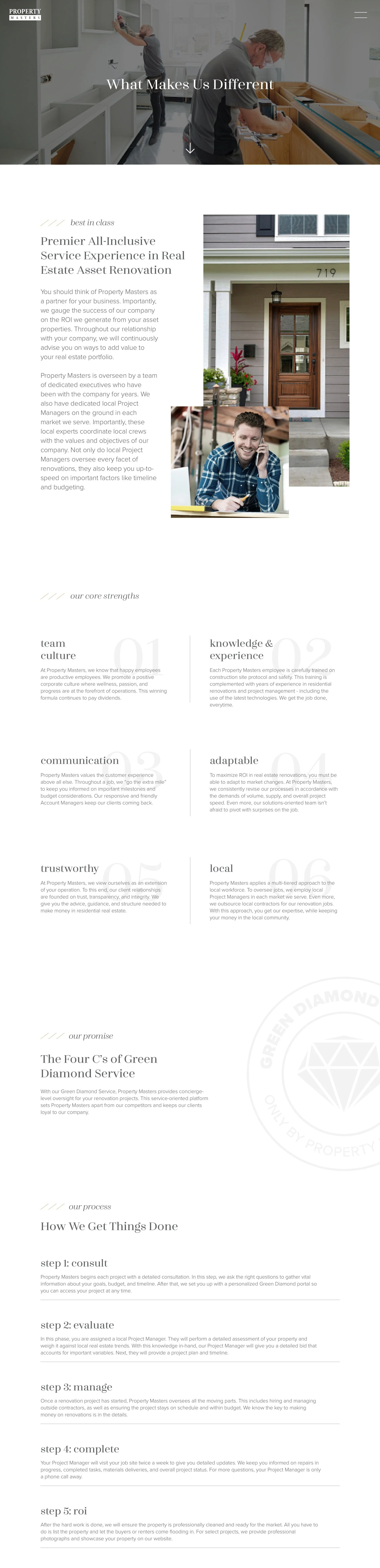

We utilized sliders in various areas of the site to create a more interactive user experience. It also served to preserve valuable website real estate - as to not bog down visitors in one specific area with too much content.
Mobile Designs
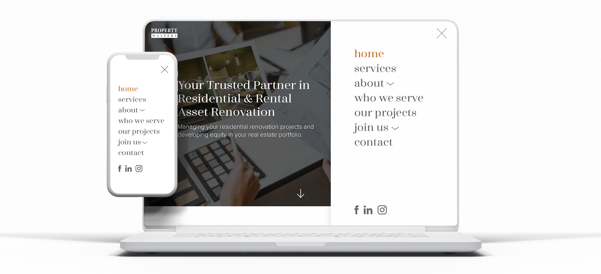
Desktop and mobile menus
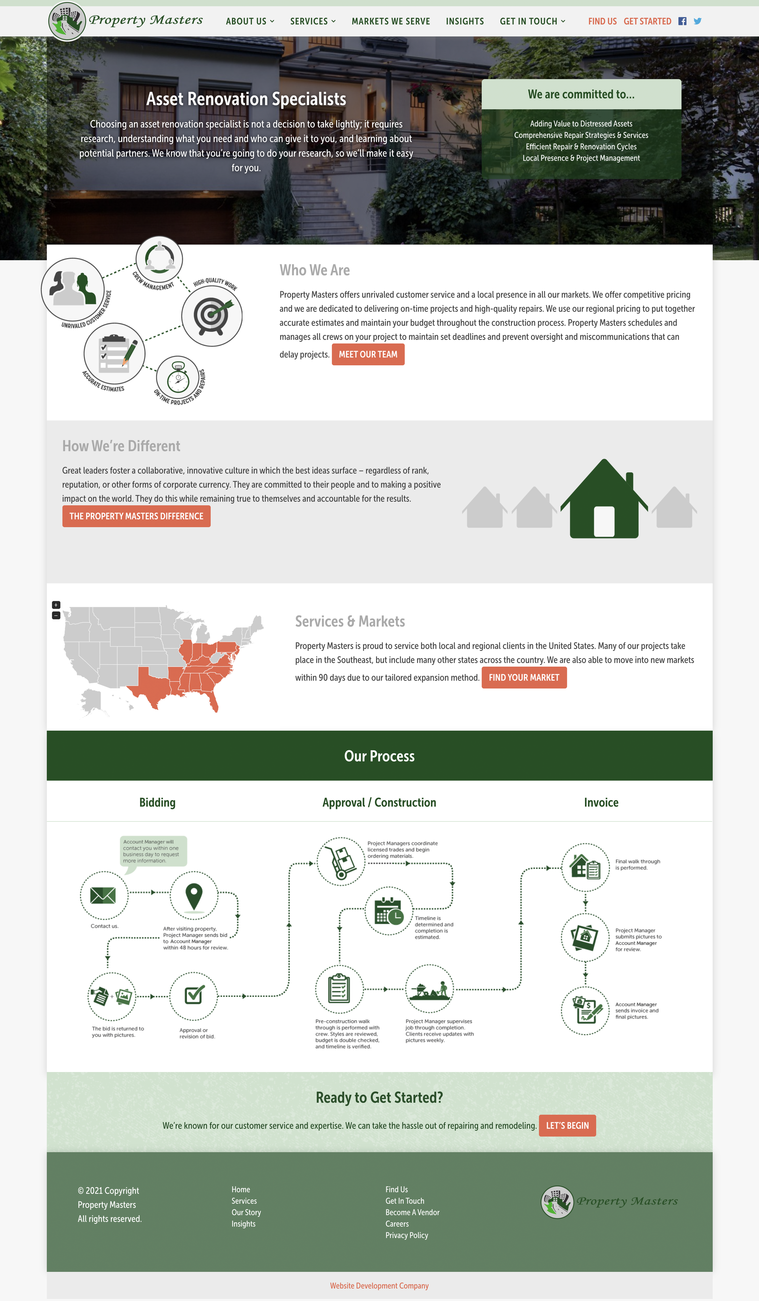
Before
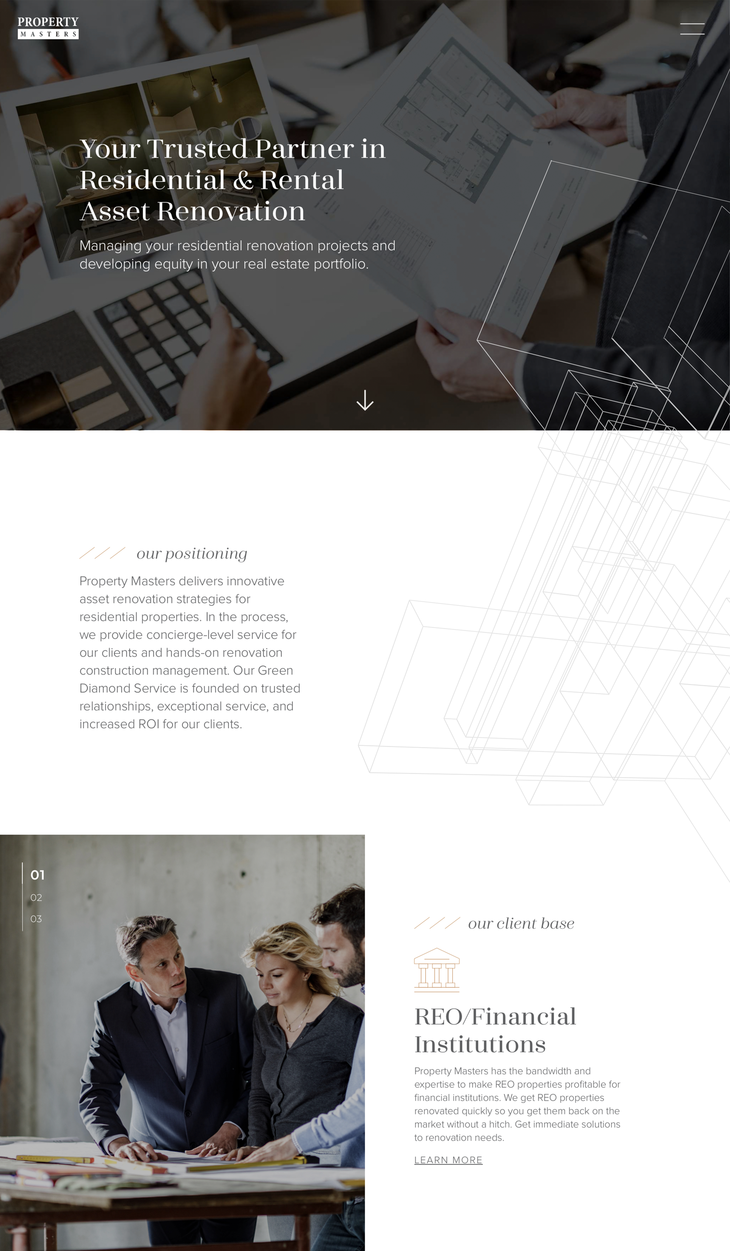
After
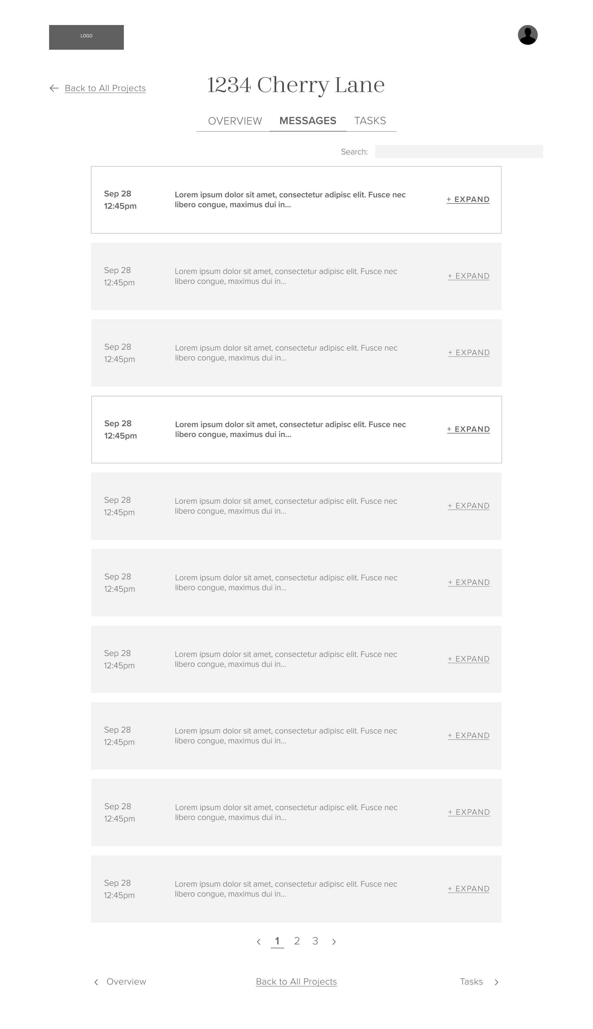
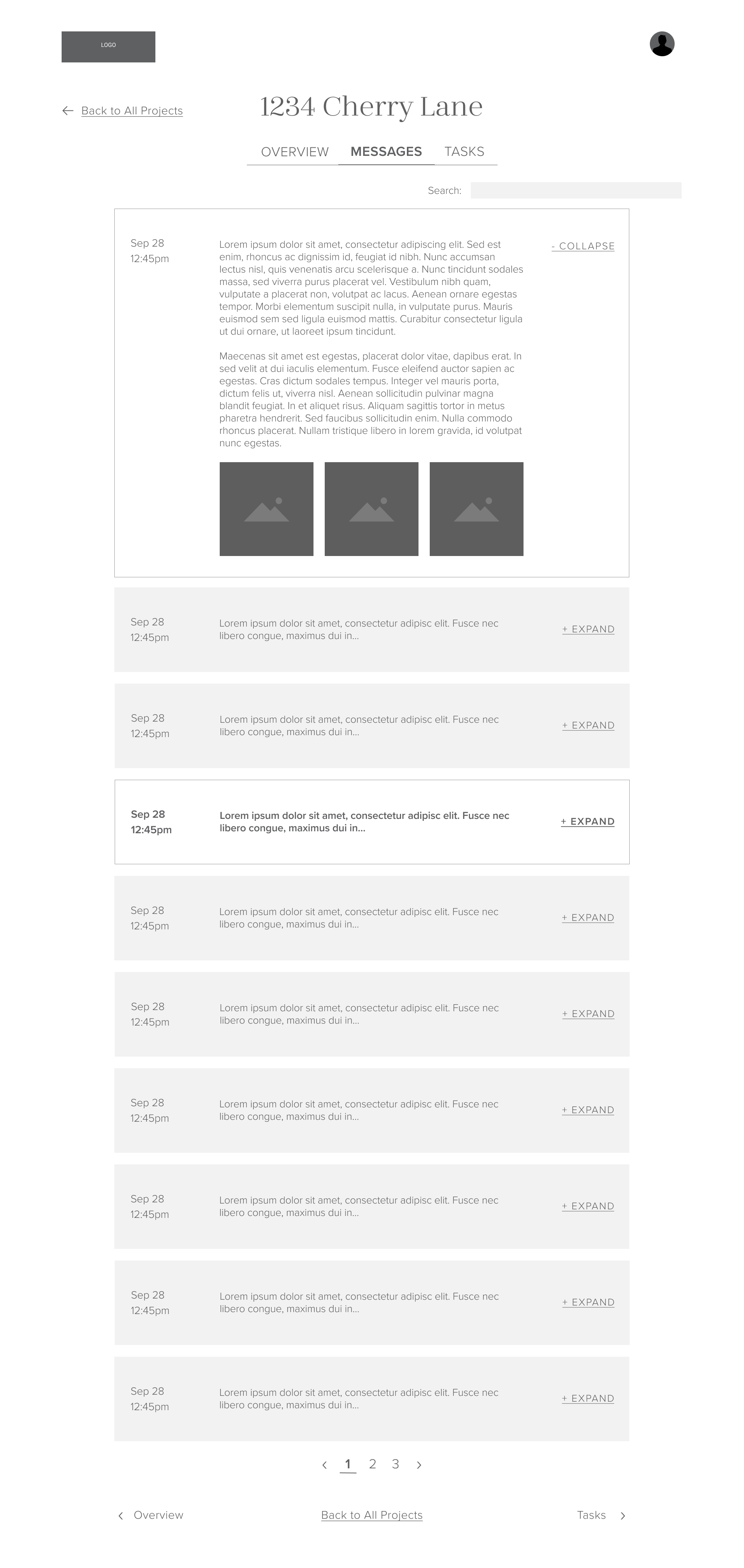
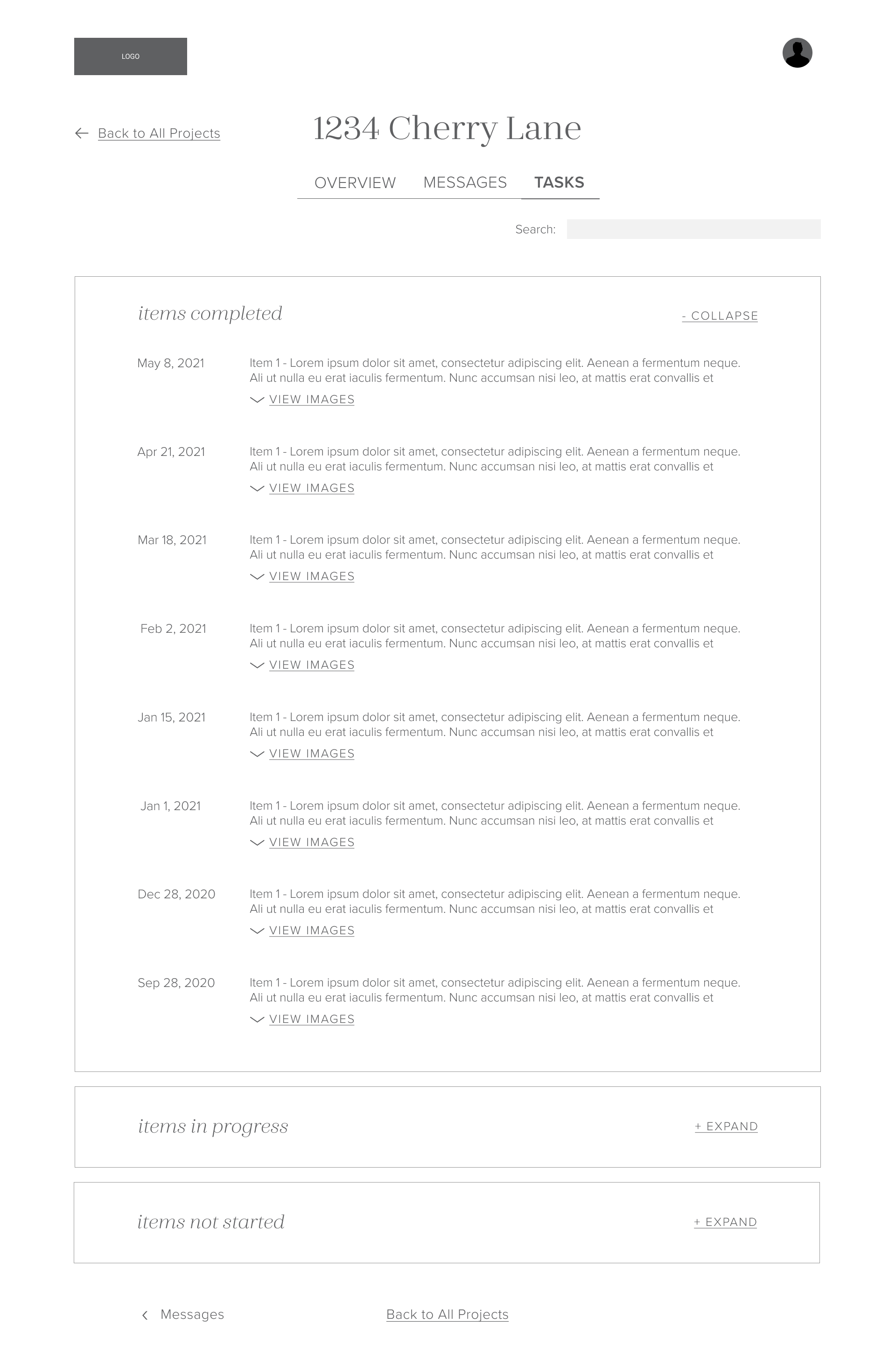
Customer Portal
In addition to their website, I also designed their customer portal. This portal would serve as the mechanism where Property Masters’ clients where they would be able to gather key information regarding their projects. Prior to this portal, Property Masters’ project managers would have to manually email their client’s project updates. With numerous projects per client, this process had become quite cumbersome for project managers. The goal for this portal was to automate and streamline the communication process by integrating the customer portal with their CRM (where they were already updating project info anyways). The goal was also to display the project info in a digestible and intuitive manner for clients.
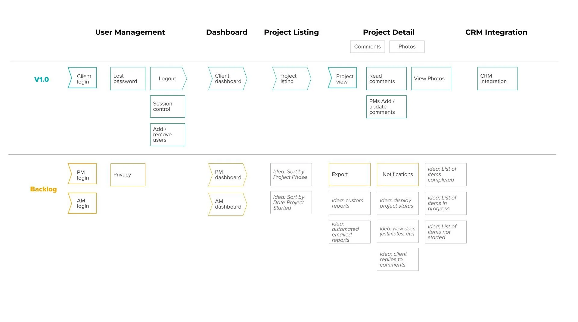
Customer Portal Story Map
To begin, I created a story map to give our client a clear idea of what we would create in the initial version, as well as the planned features for future iterations. The story map detailed the high-level activities that users could perform within the portal and the specific steps users would take to complete activities.
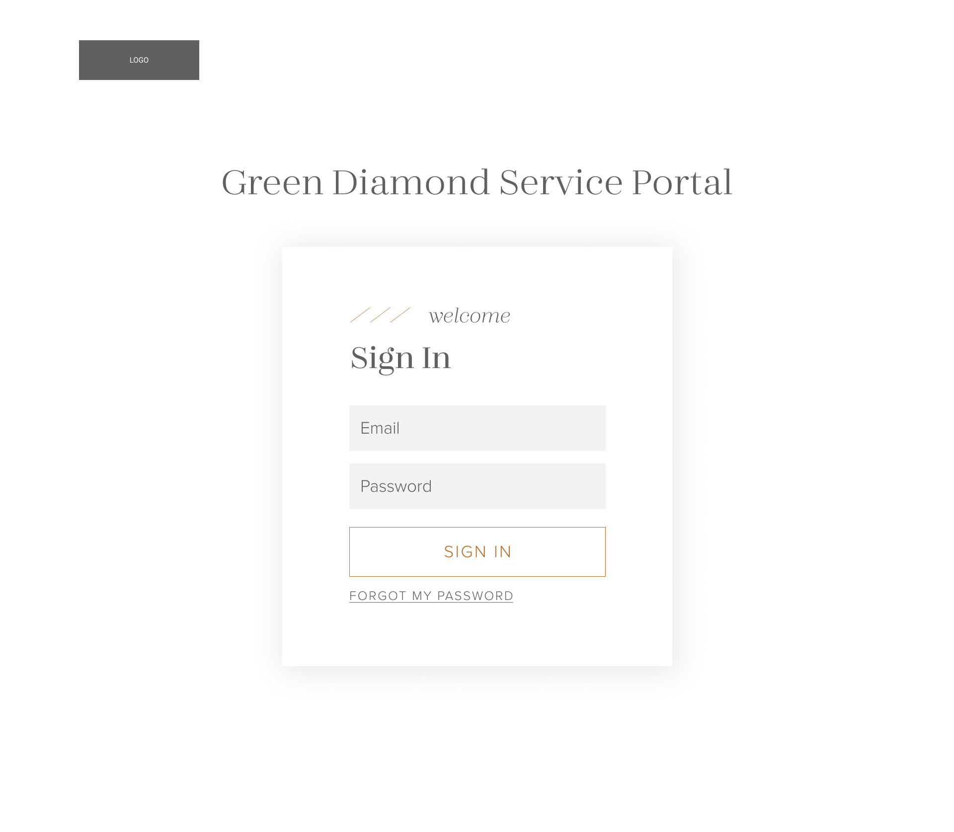
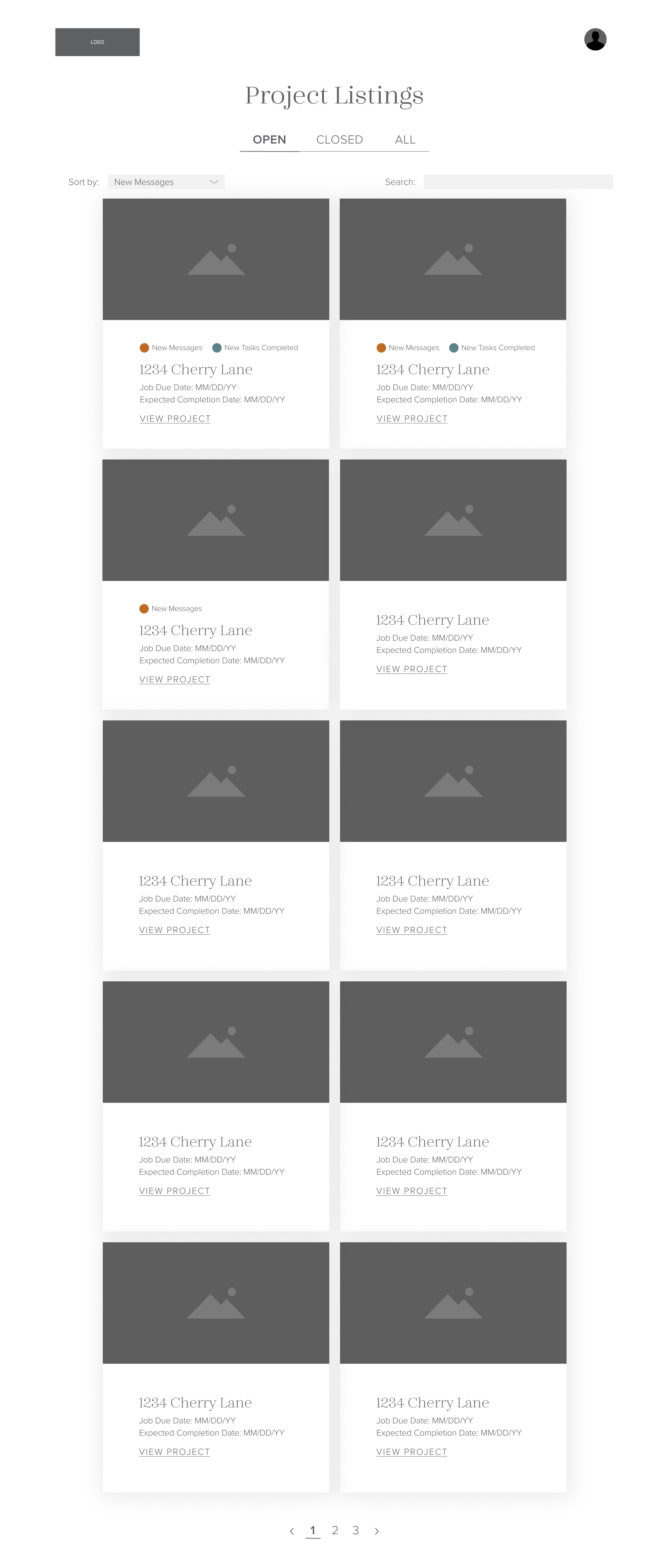
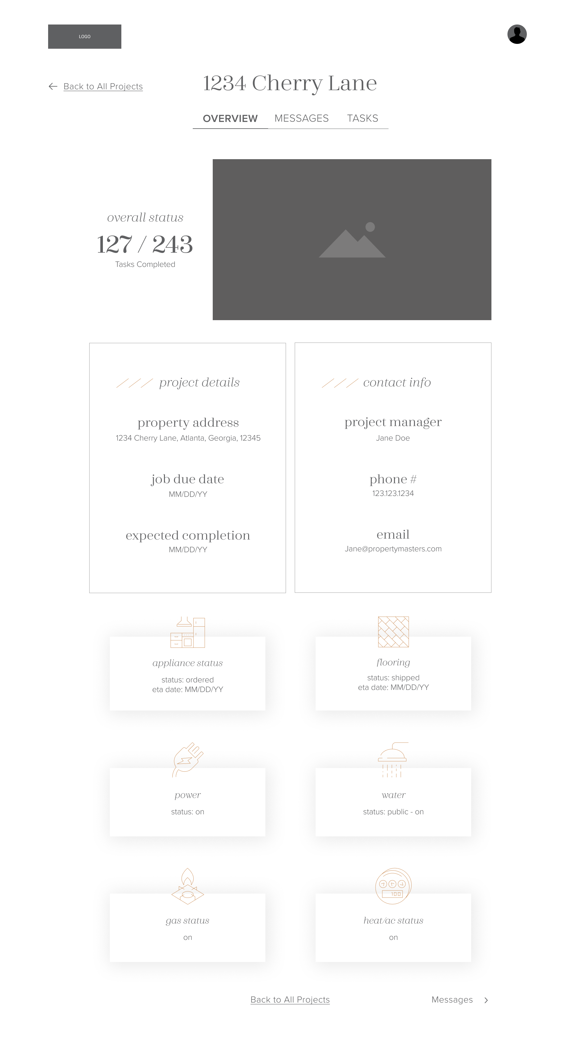
Customer Portal Design & Prototype
I prototyped it in Figma to give the client a clear sense of how their clients would interact with the portal.
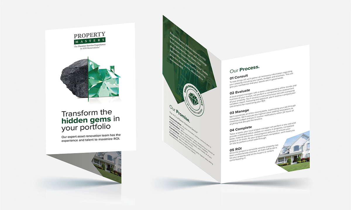
Visual Identity
I helped name their proprietary process, as well as help define the specific steps. I then designed a badge to utilize in communication materials.
Collateral
Agency: L7 Creative.
Teammates: Bob Burks