Orblu
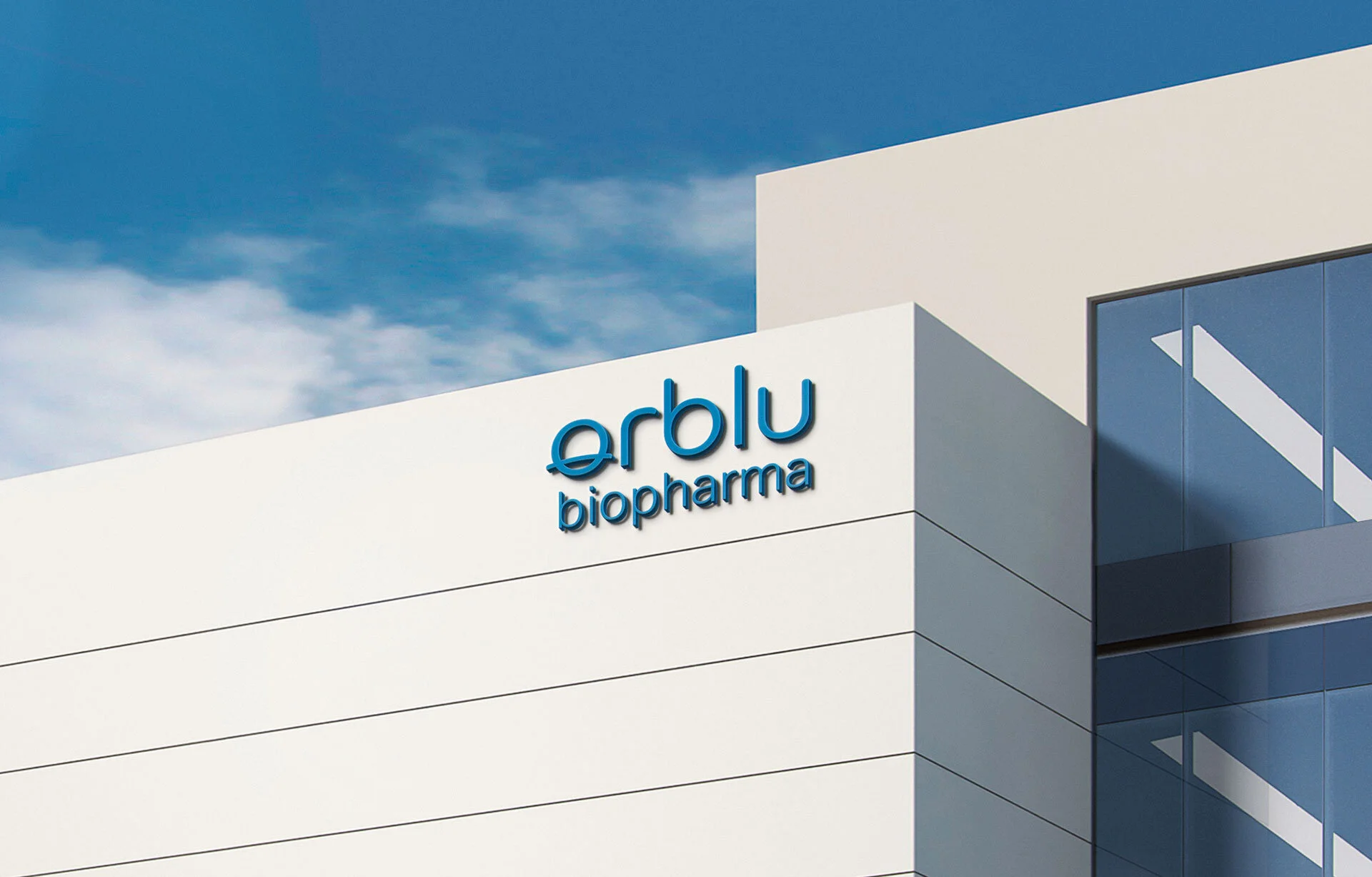
As the only continuous process manufacturing training facility around the globe there was a tremendous opportunity to differentiate our client. I came up with a memorable name and brand identity to communicate the gravitas and magnitude of what they were set to accomplish.
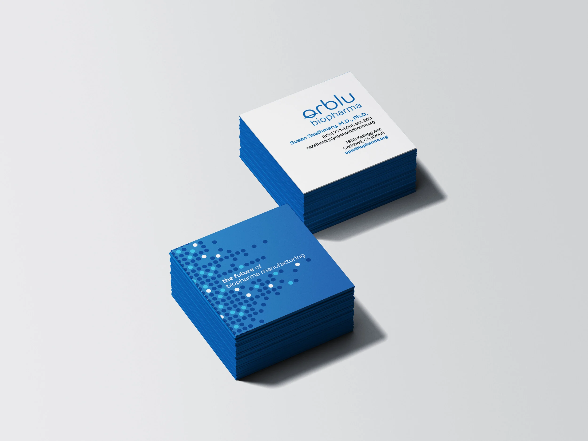
Naming. Brand Identity. Collateral.
Starting with their company name, we landed on the name, “Orblu”, a synthesis of the words “orb” and “blue,” a common representation of Earth and life. Accordingly, our client was set to have a global reach and develop medicines that will preserve, extend and enhance life for people inhabiting the most far-flung places on planet Earth. A deeper meaning was at play with this name.
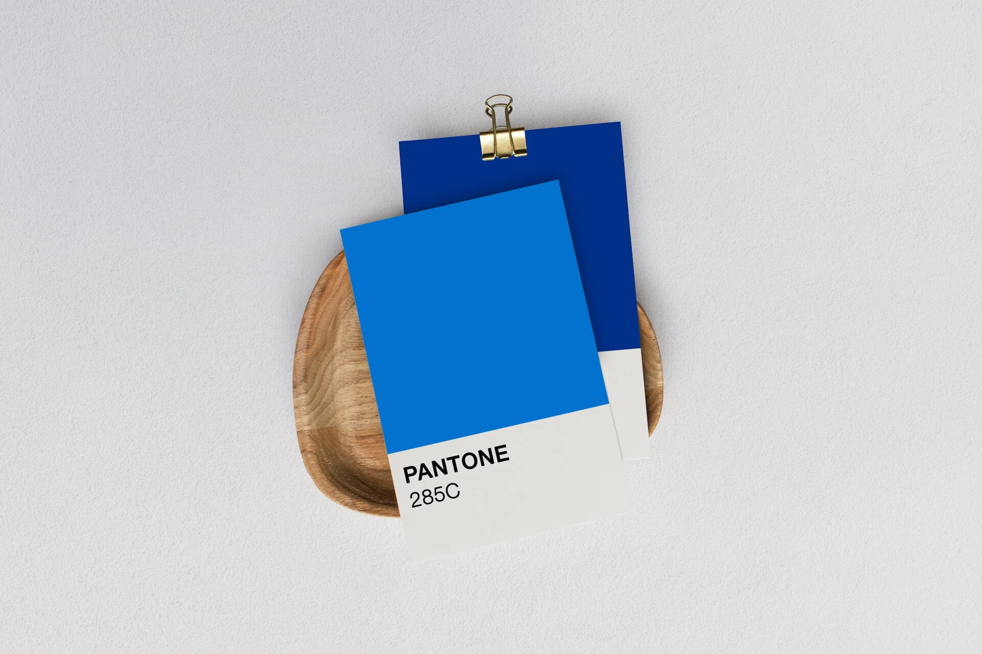
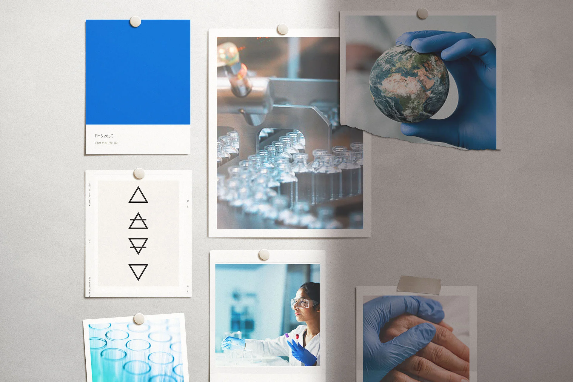
Mood board and visual story
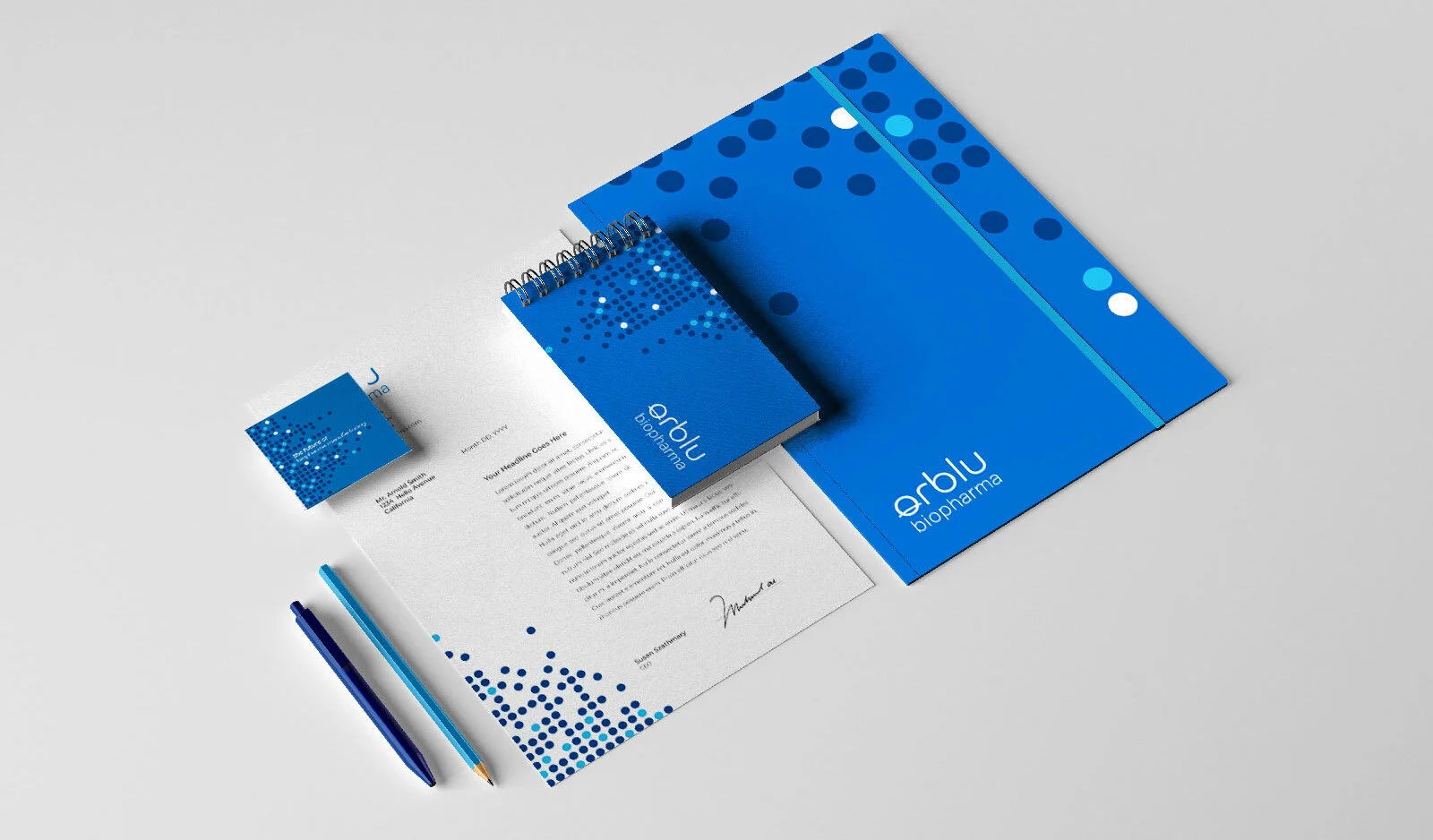
Created while working at L7 Creative.
Bob Burks created circle pattern.