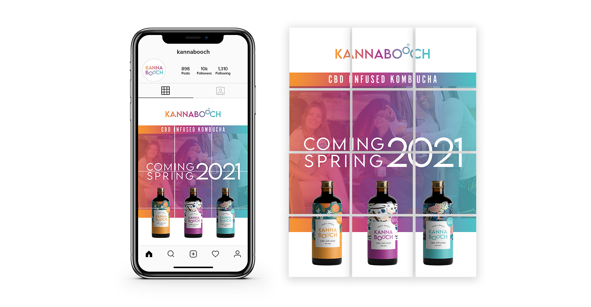
Brand Identity
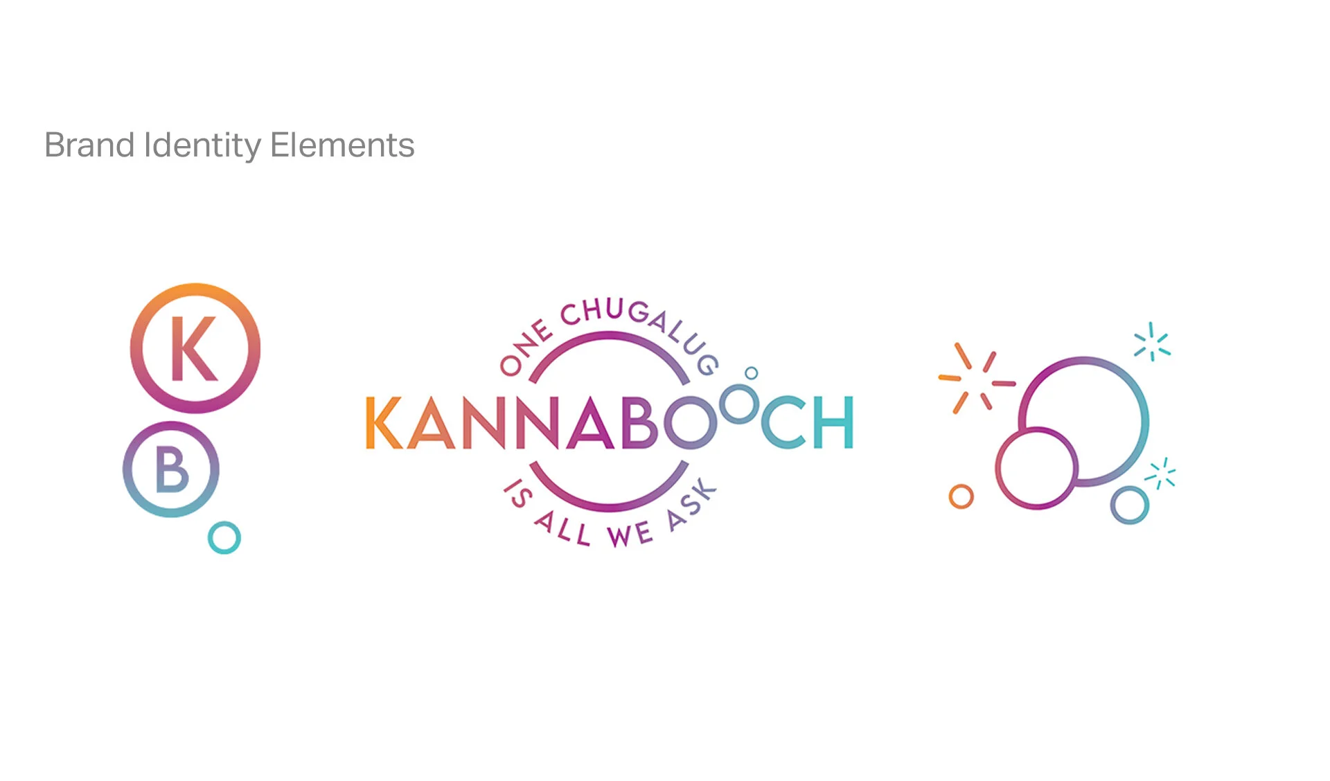
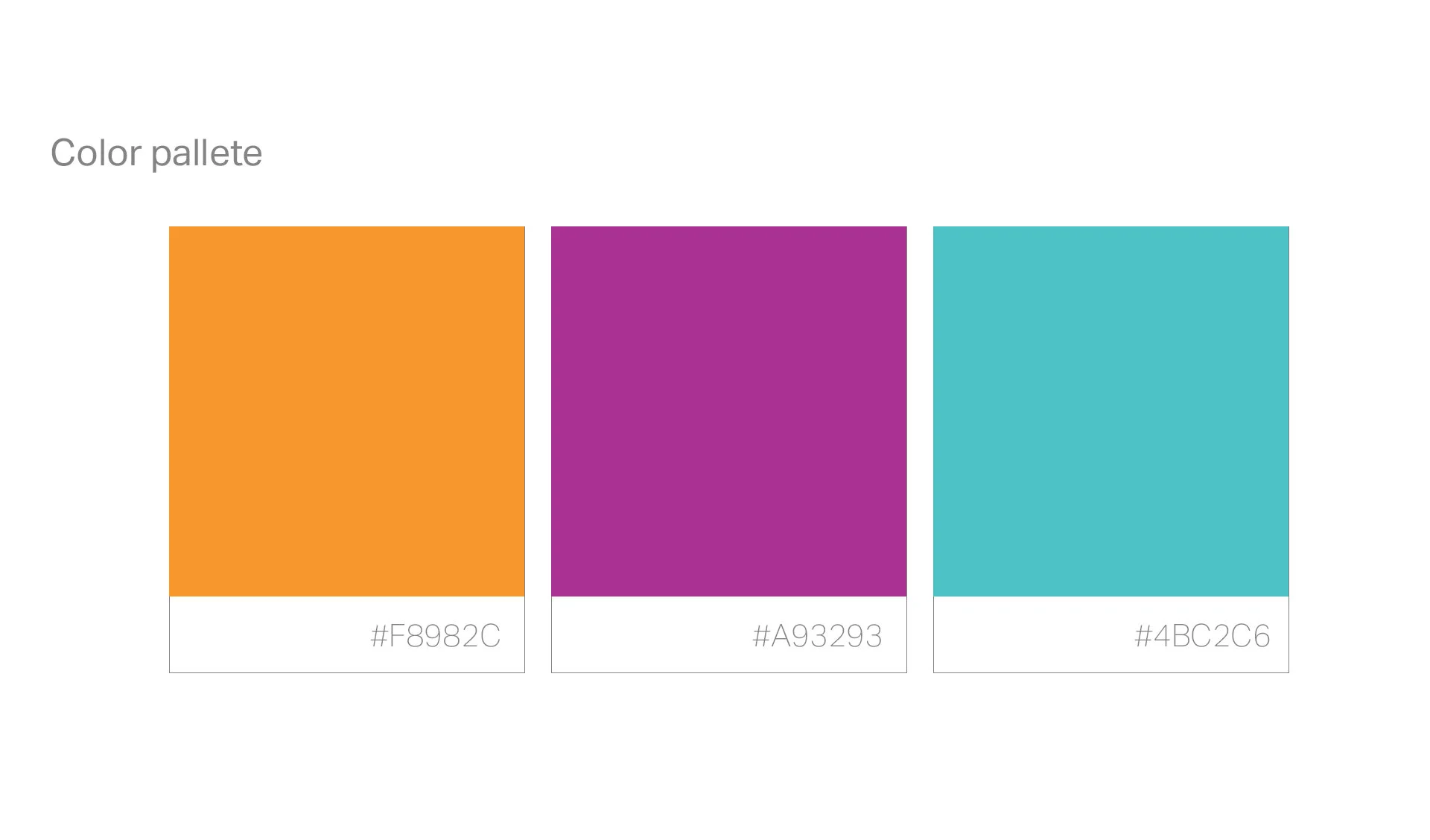
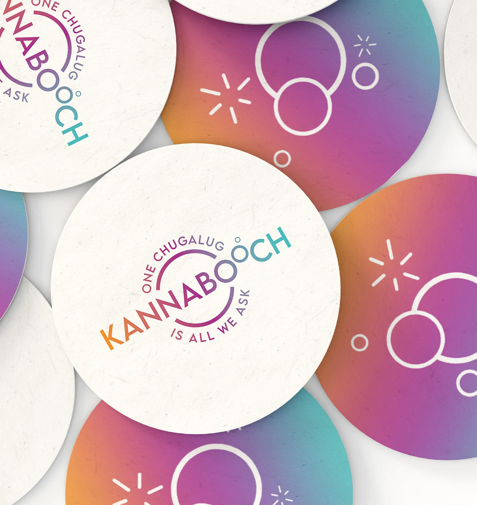
With a name that is as fun to say as “Kannabooch”, a playful identity was a natural design strategy. I created a brand identity and messaging strategy that took a cheeky approach with a bold contemporary color palette anchored in a fun, SoCal vibe. The logo and label I designed conveyed the fun nature of the brand.
The logo highlighted the “booch” in Kannabooch with a concept that was playful and an interesting take on the bubbles that help make kombucha unique. The color gradient gave way to Kannabooch’s three flavors.
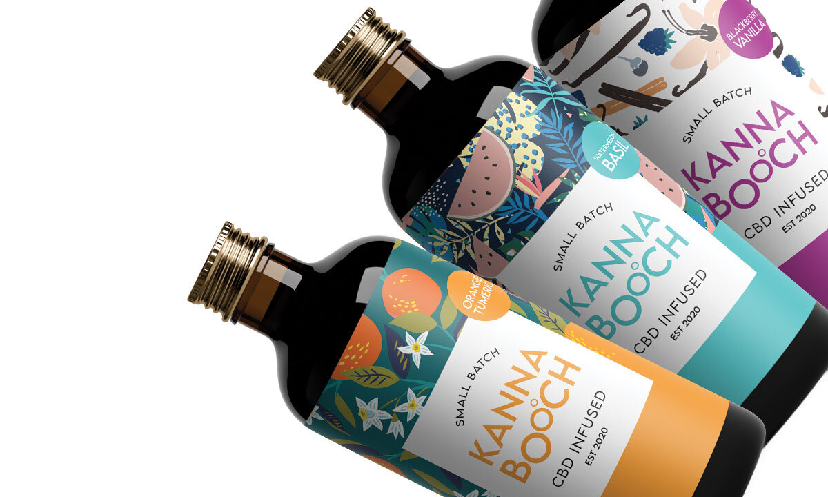
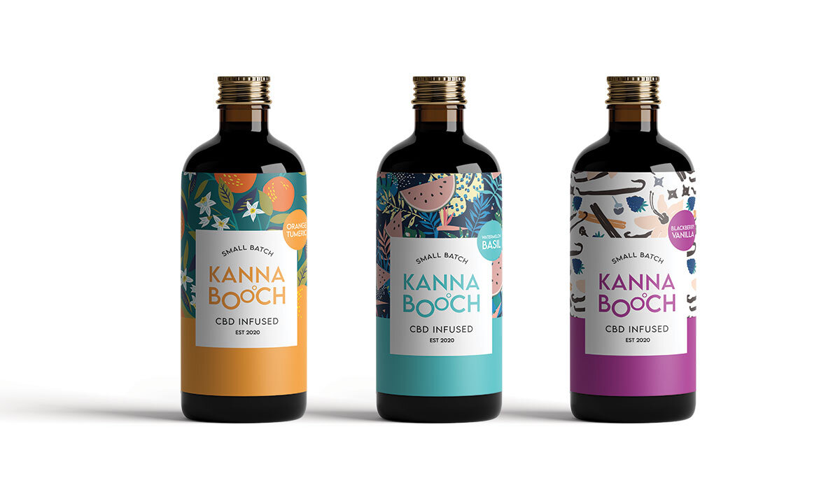
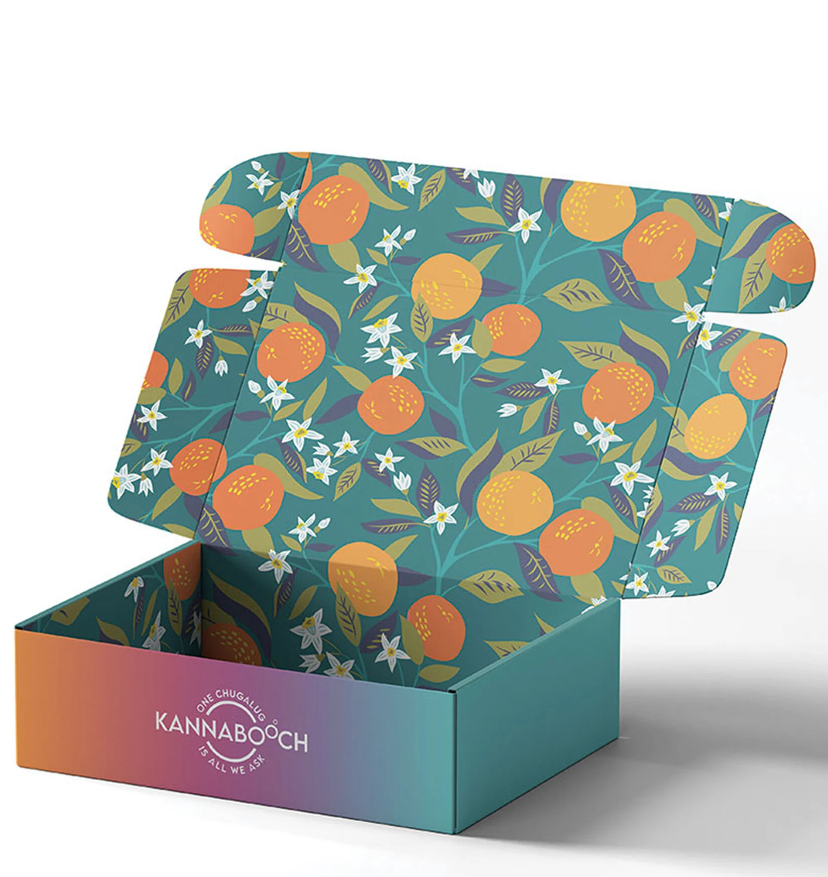
Packaging & Label Design
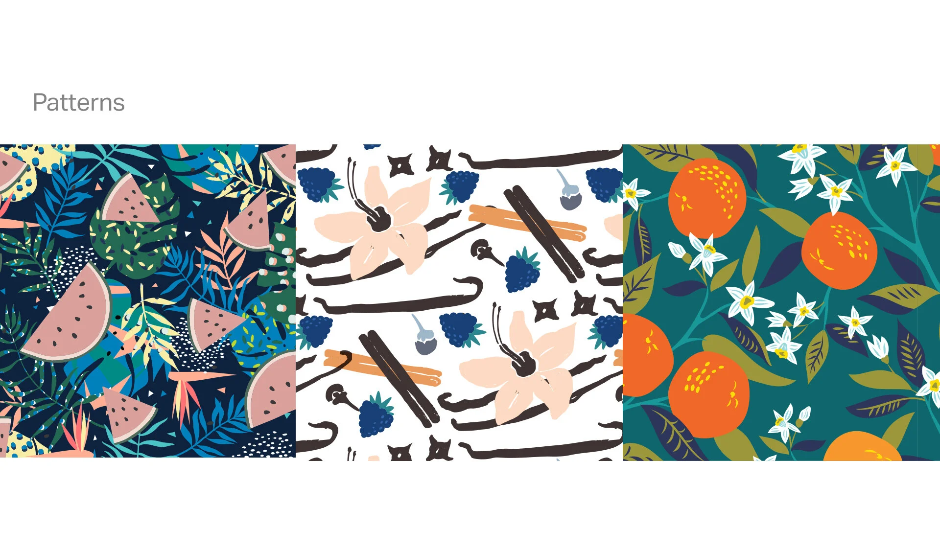
The patterns designed in each label design were modern and trendy. They gave each bottle a whimsical vibe while also hinting at the unique ingredients in each flavor. The overall bottle designs were fun and fresh and spoke to a younger audience - in line with the target audience for a cbd-infused kombucha.
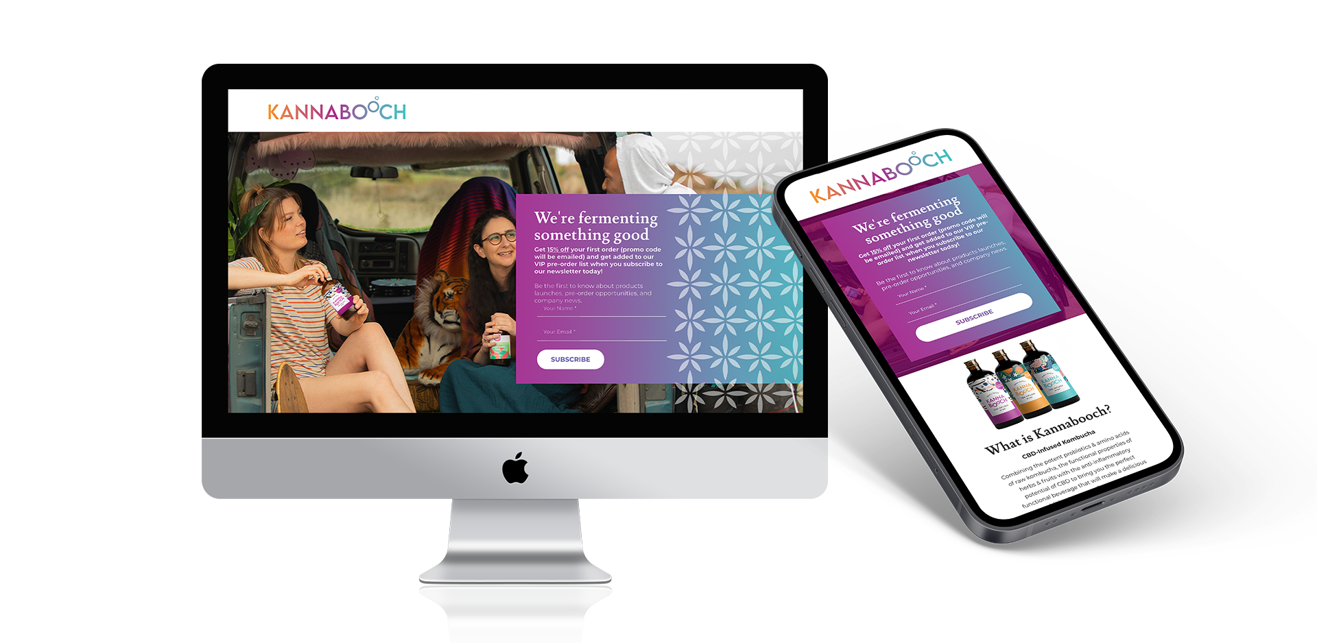
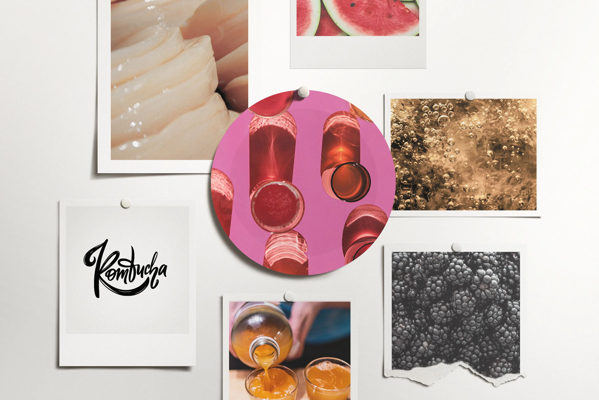
Mood board & visual story